How Amplify Credit Union's Digital App Drives Growth & Adoption
See how Amplify built a digital platform to drive growth, boost engagement, and streamline operations with a headless CMS and Salesforce integration
A Closer Look at Amplify Credit Union
Amplify Credit Union is a leading credit union with more than 57,000 members and over $800 million in assets. Amplify has been in business since 1967, operating several branches in the Austin area.
The Challenge: Building a Strategic Web Funnel for Growth
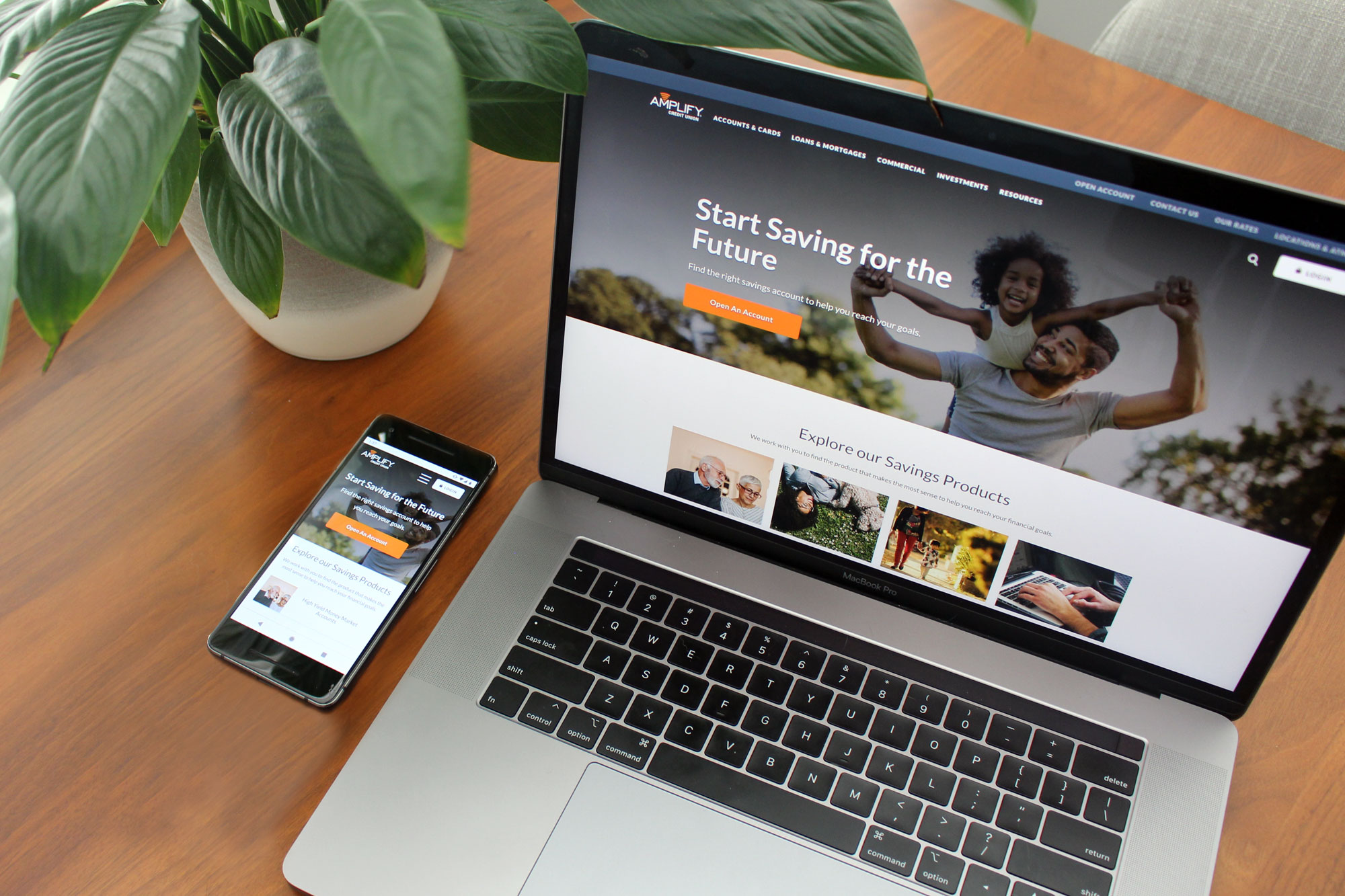
More consumers are transitioning banking solely online. This transition makes it more important for local credit unions like Amplify to have a strong digital presence. A strong website is the starting point and hub for any companies digital experience. Amplify wanted to redesign its website to push ahead of the curve in visual design, user experience, and accessibility. It also wanted to ensure the underlying technology of the new website was flexible and offered excellent performance. Amplify Credit Union turned to LaunchPad Lab to support a full digital transformation.
The Approach: Creating a User-Centric Web Experience
The project kicked off the project by flying out to Austin, TX, to gain a deep understanding of the business, goals, and what sets the company apart from its competitors. This foundational work informed a strategic roadmap for a website redesign aimed at improving both the user experience and business outcomes.
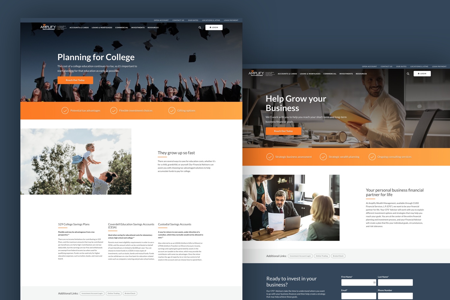
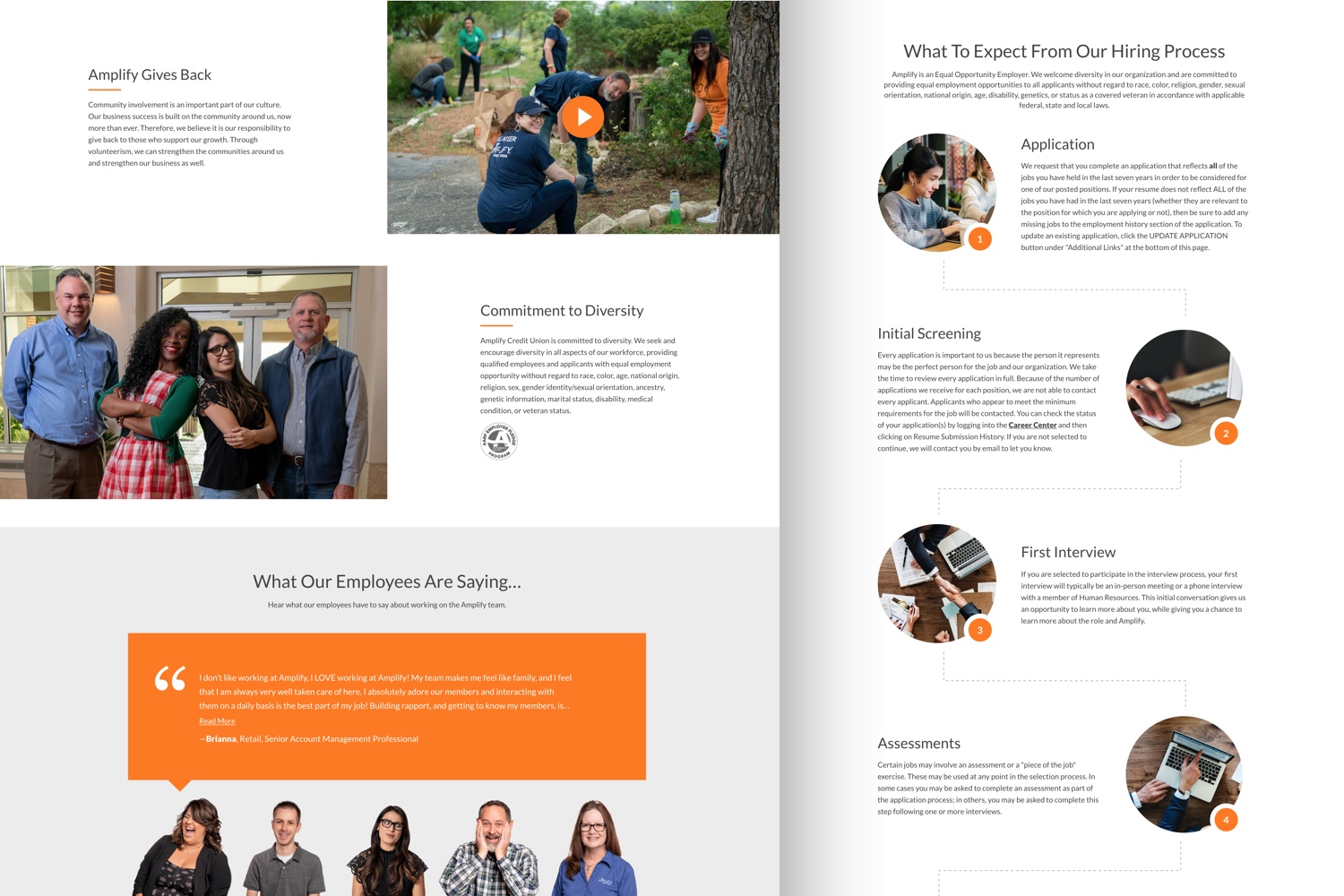
To enhance navigation and usability, multiple navigational structures were explored to ensure a clear, intuitive path for visitors to find the company’s products and services. Next, a number of layouts and a library of components were designed that would allow the Amplify team to create new pages without additional development work.
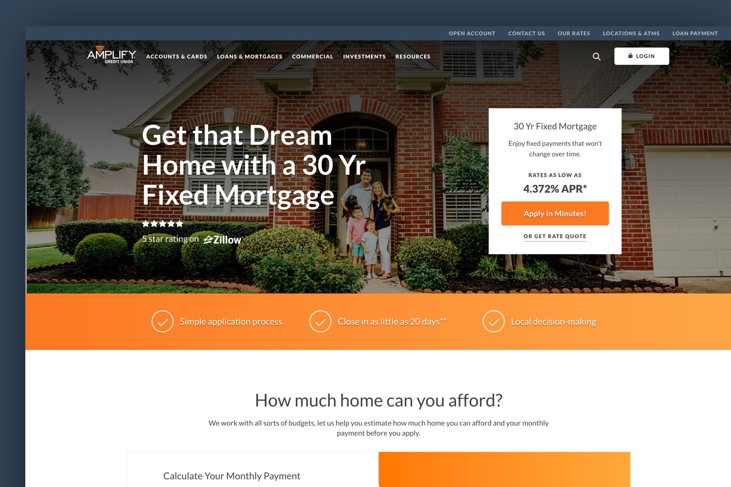
The visual strategy for the new website highlighted the organization’s local presence in Texas. The local feel had to be clean and modern to complement the company’s branches and brand. It was important to give visitors and members the confidence that Amplify is a leading and trustworthy credit union.
- ADA Compliance: Prioritizing ADA compliance and accessibility was essential. Several advanced compliance testing tools, including Siteimprove, were used to continuously scan the site for any potential issues. This continuous process ensures that the website is easy for people with disabilities to use and passes compliance testing.
- Optimized for Conversion: To drive conversions, the pages for Amplify’s banking products were designed to appeal to new visitors by highlighting key information they would need before opening an account, creating a frictionless digital onboarding experience.
The Solution: Delivering a Modern, Scalable Digital Platform
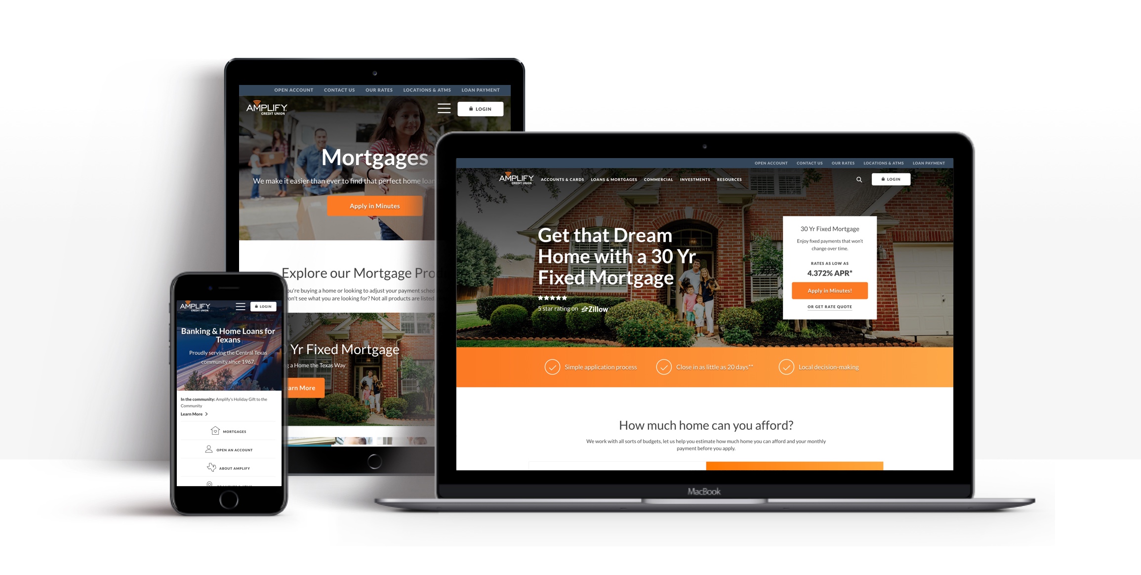
The modern, high-performing digital experience was powered by a headless CMS, a static site builder for speed and SEO, and Salesforce-integrated forms — complete with interactive financial calculators and intelligent site search to drive engagement and conversion.
- Headless CMS: Using a content management system (CMS) gives the client complete control over the content without needing developers to make changes. Using a headless CMS gives full control over the appearance of the site, plus uses the most advanced styling and code frameworks.
- Static Site Builder: Generating a static site means faster load times and better SEO performance. The progressive framework (React Static) offers the interactivity of a single-page app with the speed and performance of a static site.
- Heroku: Heroku’s continuous deployment pipeline helps quickly push changes to the code, and we use background processes to automatically update the site whenever new content is published.
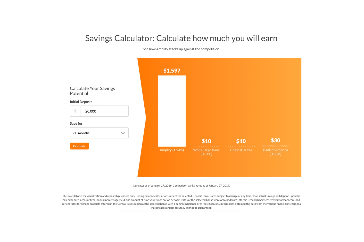
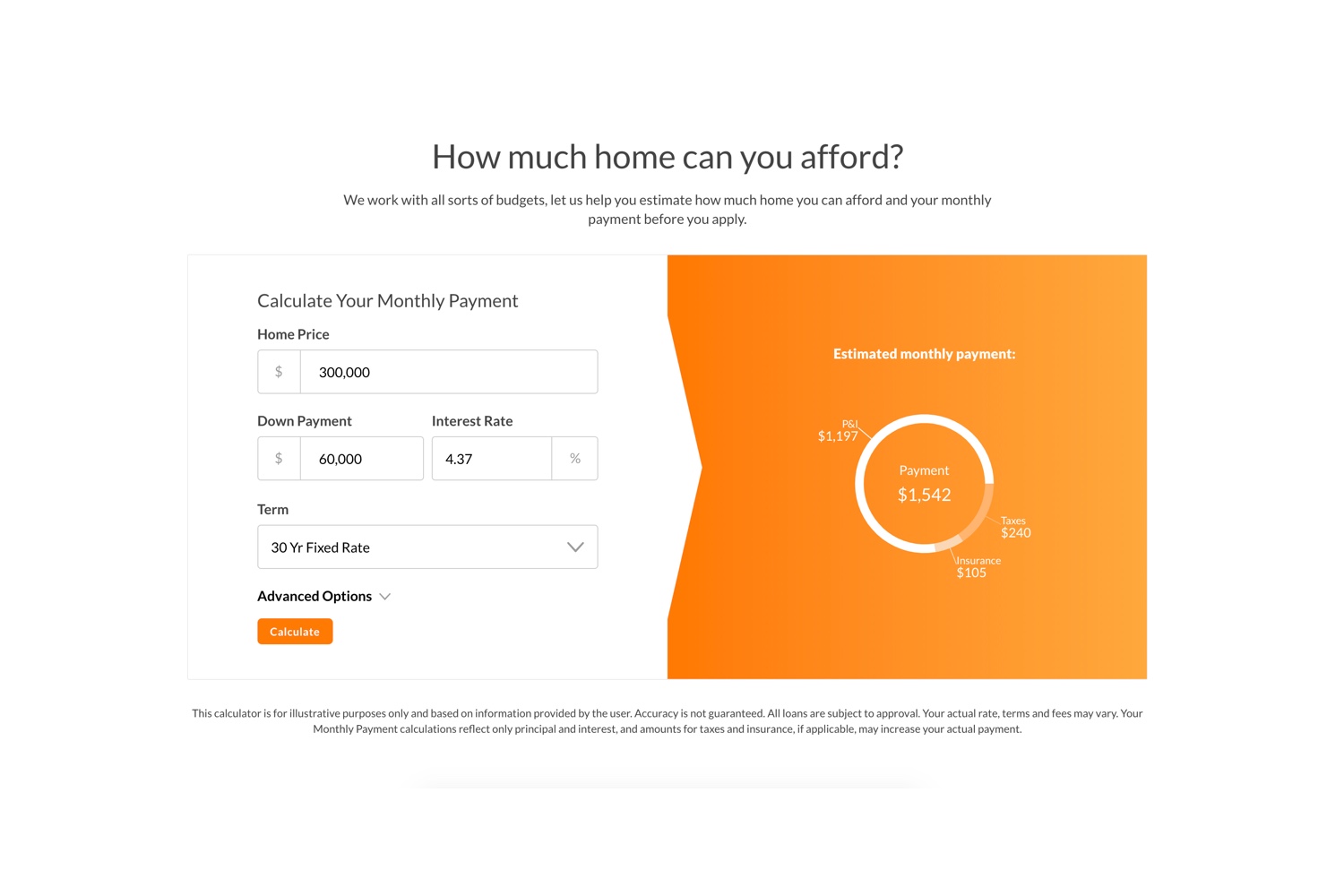
- Custom Calculators: Interactive financial calculators for Amplify’s mortgage and savings products that pull their rates as well as pull rates of competitors to increase user engagement and conversion on the website.
- Salesforce Connected Forms: By integrating with Salesforce, all the form submissions throughout the website are sent directly into their Salesforce CRM.
- Site Search: Customers can quickly find the content they need that matches their keyword search across the hundreds of pages within the website.
The Results: Accelerating Growth, Driving Engagement, and Delivering ROI
Amplify’s new website delivered immediate and measurable impact. Faster load times, an optimized user journey, and a more modern, local-first design significantly boosted visitor engagement and conversion rates. The flexible headless CMS empowered Amplify’s internal teams to easily manage and update content without developer support, streamlining operations and accelerating marketing initiatives. Integration with Salesforce automated lead capture, enhancing sales pipeline visibility and speed. Overall, Amplify is now better positioned to compete in a digital-first banking landscape, with a high-performing platform built for future growth.
Ready to Build Something Great?
Partner with us to develop technology to grow your business.


