A few months ago, I got ready to unveil my new invention that was going to vastly improve life at the LaunchPad Lab office. I’d worked for weeks on this thing ordering parts, soldering said parts, and writing software that made said parts talk to each other. I get excited about all Demo Day projects, but as I got up to the front of the room that afternoon I was all nerves and eager energy. This was going to be a great presentation!
As I readied to launch into it, a kind soul piped up from the back of the room.
“Now we get to find out why Wade has been videotaping us in the restroom!”
And just like that, I was thrust into the world of UX design for hardware.
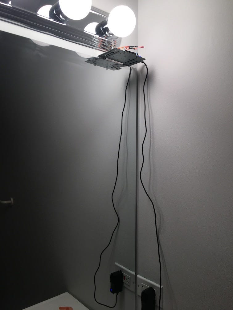
Now this may not be news to you, but putting a computer in the office restroom isn’t always a good idea. Especially when it’s hung high upon the mirror with chords and wires dangling and blue lights blinking.

If I’d spent a some time thinking about the user experience of my product instead of geeking out over the technology I would have seen that coming.
But here’s the thing – hardware is hard! And to understand why I put a computer in the restroom we need to jump back a bit and cover what led me to this point.
I have a two-part problem at work. Part one is that I’m lazy. Part two is that we have one restroom in the LaunchPad office, and it’s not visible from my desk. That means that every time I need to use the restroom I have to get up and walk around the corner to check if it’s open. If it’s not, I have two options: awkwardly stand around waiting, or march back to my desk with my head down while sad Charlie Brown piano music plays in my head.
I don’t like either of those options. In a past life I would have grumbled quietly about it, but this is 2017 and I’m a software developer, which means THERE MUST BE A BETTER WAY. With that mentality I set out to build a way to check the restroom’s vacancy without leaving my desk.
Here’s what happened along the way.
Attempt #1: Slack integration combined with a light sensor.
We use Slack at work constantly and it’s one of the few apps I have open most of the day. I love its integrations and I have some experience building them, which made it the first place I turned to for this project.
The idea was pretty clear in my head: make it possible to virtually “knock” on the restroom door. Whether the room was occupied was determined by the light level in the room, which was read by a light sensor that sent that data over Wi-Fi using a Particle Photon to a basic Ruby app. To find out if the restroom was open all we needed to do was type “/knock” into any channel, like so:

I was able to build this quickly and it seemed like a viable UX to me. The Slack integration was private, so nobody else in the office could tell you were digitally banging on the restroom door. I felt that discretion was important.
After “launch” a few weeks went by and I noticed that people were still walking over to check the restroom. And what’s more, I was still doing that, too.
That’s when I realized I’d added a new step to people’s workflow that wasn’t getting adopted. Going to Slack to check if a physical door is open isn’t intuitive and there’s a disconnect there. Combine that with the fact that you need to be in front of a computer for this to be effective and we had a bad user experience on our hands.
Back to the drawing board.
Attempt #2: Vacancy light combined with a light sensor.
I wish I could take credit for this idea, but it came from Brendan, our Co-Founder and CTO at LaunchPad Lab.
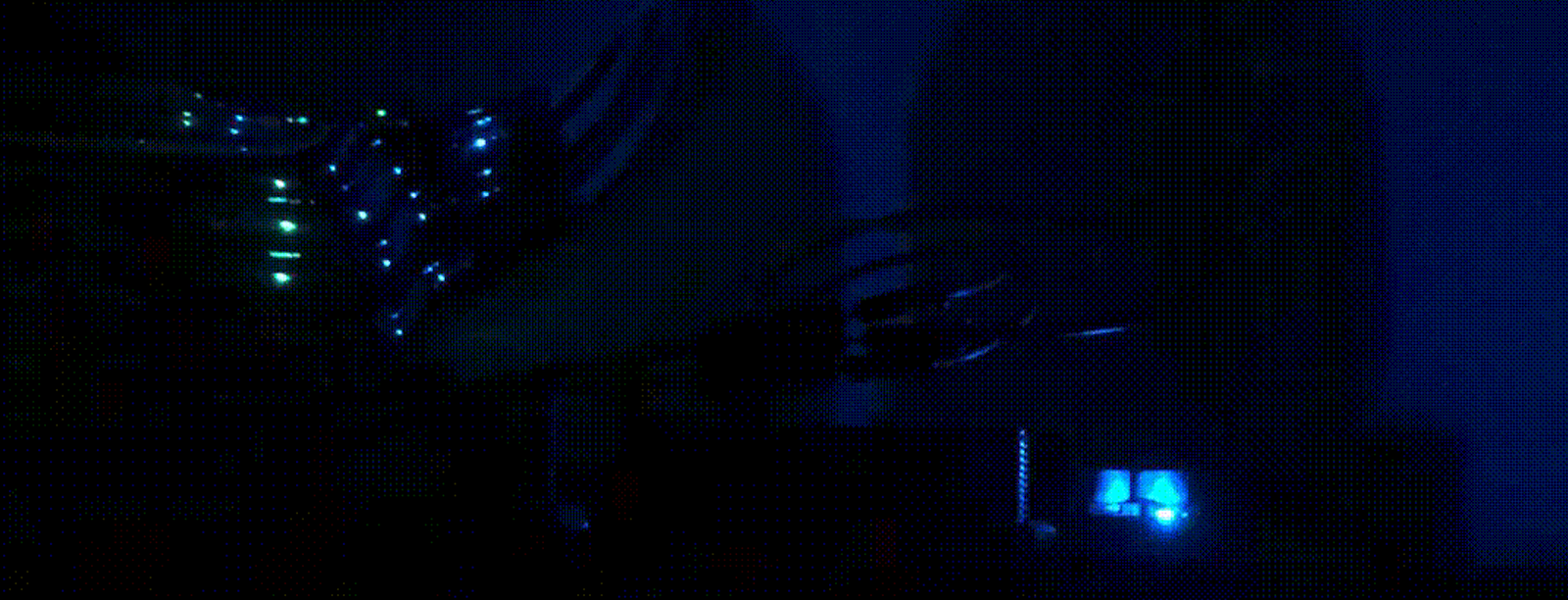
In our office we have a light that sits on a table in the middle of our office, made for us by what is now mHub Chicago. It’s a light with our logo that shines a bright blue when lit up. It’s also connected to the internet thanks to a previous hack project Brendan had worked on.
He had the bright (pun-intended) idea to combine the logo light with the light sensor in the restroom to make a vacancy light. The end result functioned just like an airplane’s “occupied” lamp. When the restroom light is on so is the logo light.
This was a key change and vastly improved the user experience. Because the logo light is centrally located you can see it from just about anywhere in the office and you don’t need to be at your computer. We did keep the Slack integration, though, just in case someone can’t see the light from where they are!
This was simple and intuitive. I knew we were onto something when the connection on the logo light broke one time and multiple people in the office asked me when I was going fix it!
Even after settling on the vacancy light, we still currently have a crucial UX issue, and that brings us back to the core problem I mentioned at the start: we have a blinking light hung high on the mirror in the bathroom!

Here’s where hardware has a unique UX challenge. It occupies a physical space and takes a physical shape. The components that make up the light sensor have lights that blink and that kind of electronic feedback has connotations that people may not be comfortable with in a private space. That kind of subtlety wasn’t something I prepared for going in.
So with that we begin the next leg of the journey, which is to improve our user experience by improving the form of the hardware itself. That’s going to take us into the world of custom printed circuit boards and 3D printed cases to house the board. The goal is to have a more friendly form that doesn’t feel alien inside of a restroom. I’ll be documenting that process as we go so stay tuned!


