Search is one of those features that on the surface seems straightforward to design and build, but never is. We tend to find that it falls into the “Basic Needs” category of the Kano model; you don’t get points if it works really well, but you definitely get dinged if it doesn’t. And that’s because users have been spoiled by popular products from across the web that have extraordinary search experiences. Their expectations have been raised.
We often hear comments like those below from our clients when we are helping them build new products or redesign current experiences:
“We want our search to work like Google.”
“Users are asking for more robust search options.”
“Search should be a much smoother experience.”
It’s our job as product builders to look through this foggy design direction and understand the why and the how behind search. And ultimately design a better experience than exists today. Without that seamless experience, an entire product can fall flat. Your users’ trust in you takes time to build but can evaporate completely with one poor experience.
“The fact that the people who built the site didn’t care enough to make things obvious—and easy—can erode our confidence in the site and the organization behind it.” – Steve Krug, Don’t Make Me Think
As a result, we can not allow search to be an afterthought. It must be handled with care and deliberately designed. It’s one of our favorite product challenges to address. There is a unique blend of technical constraints, different user jobs-to-be-done, and UX considerations when designing a search experience. And despite the fact that every search experience is slightly different, there are plenty of common themes and patterns that we can reference. Below is a list of those considerations when starting a new search project.
Lookup versus browse
The first, and most critical step, is determining how and why your users use search. There are two distinct paths we see — lookup (trying to find one search result) or browse (trying to find many results).
Lookup is common in directory-type applications. The core purpose of directories are to find a specific piece of information. The user may have a name or ID number, and want to find the profile of that account. They are looking for one piece of information; contact info is a good example. The goal is to get in and out. The focus of our design should be about getting to one specific result, and serving the user the pertinent information quickly.
By contrast, browse is common in social platforms are other rich content applications. At the time of running the search, the user may not know the specific result they are looking for. They only know some criteria or attributes of the results they want. Therefore, the desired output of a browse search is as many relevant results as possible.
The scenario we see most often is a combination of both. There are times when a user knows the exact object they are looking. And there are times when they know the exact attributes of that object.
A great example of this would be something like OpenTable. Sometimes you know the restaurant you want to go to. You just need to find an available time there and then book your reservation as fast as possible. That is a Lookup search. Other times you are free on a Friday night and are craving Mediterranean food. In that scenario you want to see all the options available, and browse through them.
The lookup versus browse flow has design implications on two key UX patterns. First, if lookup is important to our users, we leverage auto-complete in free text search fields. This allows a user to quickly jump to a specific result. Second, if browse is important, a well thought out results page becomes critical. On the results page, we will need to consider filtering, pagination, result sorting, and ranking.
Types of search results
A common trap that we see in search is trying to simplify the experience too much. It usually starts when there are many fields and filters and the new design merges them all. The challenge this creates is trying to communicate what the user is actually searching for. If the design is not explicit, this may result in flows that are more confusing.
There are two types of results to consider; the list of objects on the results page and the list of results in the auto-complete. Specifically, whether the result objects are of the same or of different types.
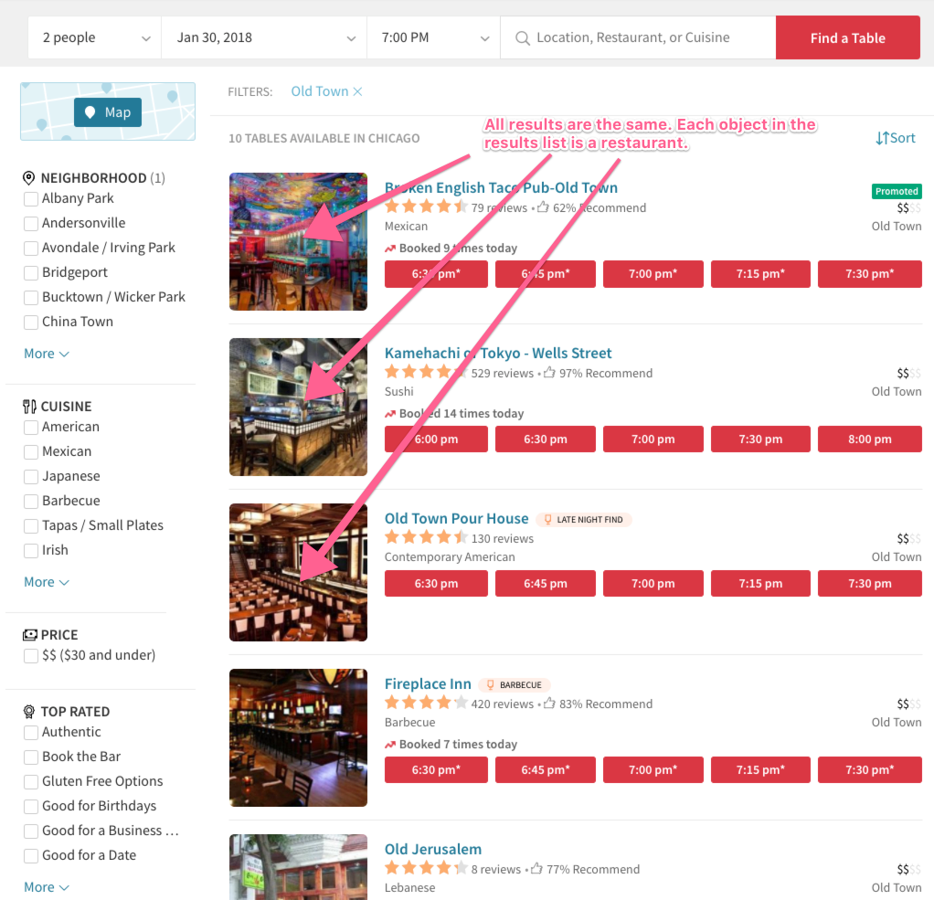
Let’s revisit our OpenTable example and this time look at the search results page. Every result object is a restaurant. From a data structure and design perspective, that means every result is the same, and the user clearly understands what they are seeing.
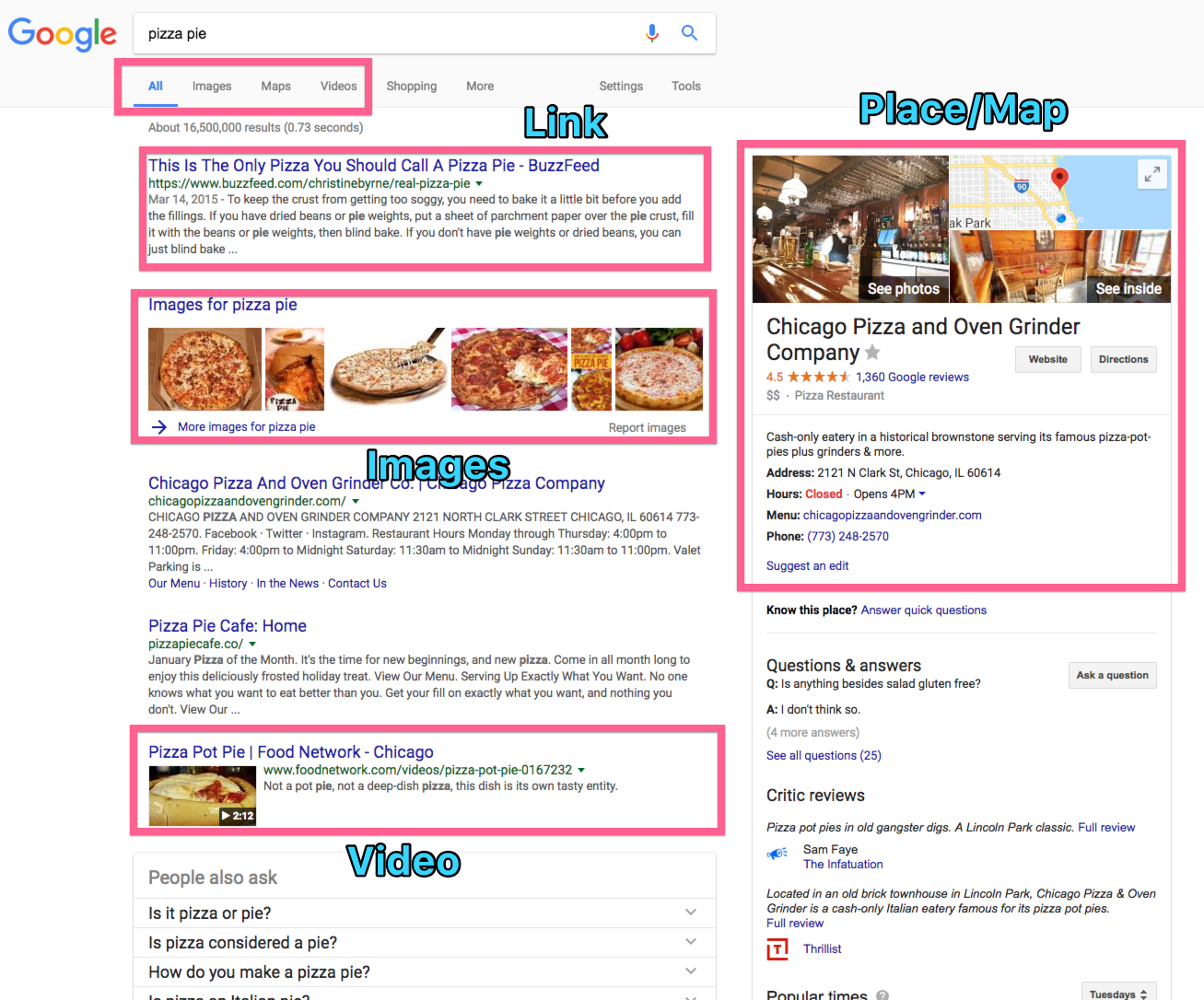
Google, by contrast, shows multiple different types of results in the same view. This is very hard to get right and can be a design and engineering challenge. In the example below, the user is displaying “All” results for the search “pizza pie.” Google commingles Links, Images, Videos, and Places in the same list! Each of these objects has a different design anatomy and must fit together in an intuitive way. Proceed down this path with caution as we often make big design leaps and assumptions when we try to do this. We catch ourselves saying things like “let’s use an icon on each result,” or “let’s make each result a different color to distinguish it’s type.” This can work sometimes but often it’s confusing to the user.
Now that we have discussed different search result types, let’s discuss how this looks in the context of auto-complete. The key distinction to consider here is whether your auto-complete will show filters, search results, or both. And how will the design distinguish between all of them?
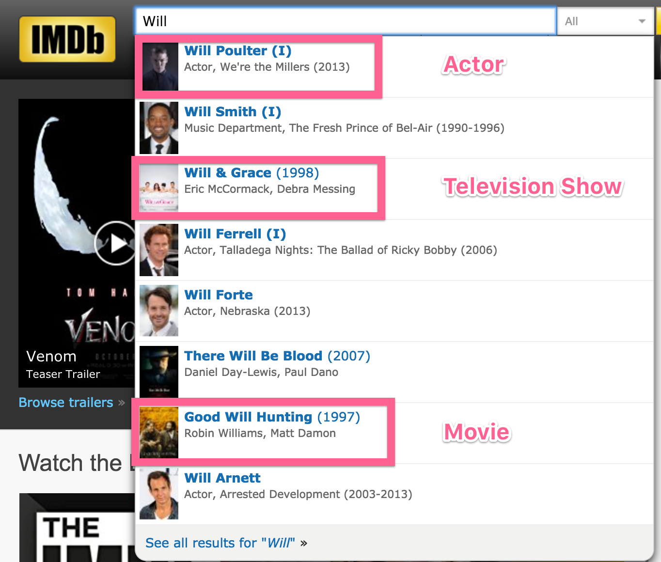
Showing different types of results in the same auto-complete list can be tricky, and should be designed deliberately. As always, it depends on the user’s context and what specifically they are searching for. IMDB for example has very little distinction between result types in the same drop down. But the user probably knows the difference between an Actor and a Show.
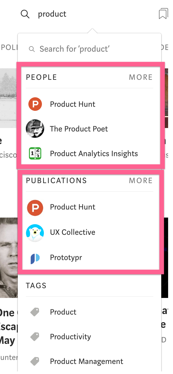
Many times, the distinction in the objects is less clear. Physically separating the types of results in the same list and using headers is helpful, like Medium does below. People and Publications may easily blend together, and there is a reasonable chance the user doesn’t know which one they want when they start typing.
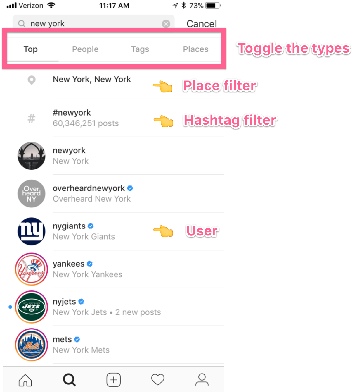
The last, and hardest, auto-complete design to handle is when filters and result objects live in the same drop down. Distinguishing the user’s search intent in this context is difficult so the options need to be clear. Are they trying to jump to a specific result or a run a search with that filter applied? Instagram communicates this well by using a combination of icons and tabs. They have hashtags, locations, and accounts all in the same list, but clearly distinguish between them.
Filtering and free text
Once we figure out how someone is searching, and the types of results they expect, we need to decide how they will build that search. This is where we need to design a combination of free text inputs and filters. The way a search can and should function is largely dependent on how the data is structured.
As with most cases, sometimes the distinction between filters and free text is clear. Other times, it’s a balancing act of both. Let’s look at the distinct examples first.
Search by filtering is common for reservation systems; think airlines or hotels. Below is an image of Southwest’s flight search box. It combines an auto-complete text input, a date picker, radio buttons, and drop-downs. But these are all just filters for specific attributes of the search. Filters are simply predefined choices that can be applied to refine the overall search query.

Sometimes, free text search is clear as well. Basecamp has a good example of free text search. In Basecamp, a user can create Documents, Messages, and Check-ins. All of which are long form, unstructured text files. Because of the type of content in Basecamp, a free text search makes sense.
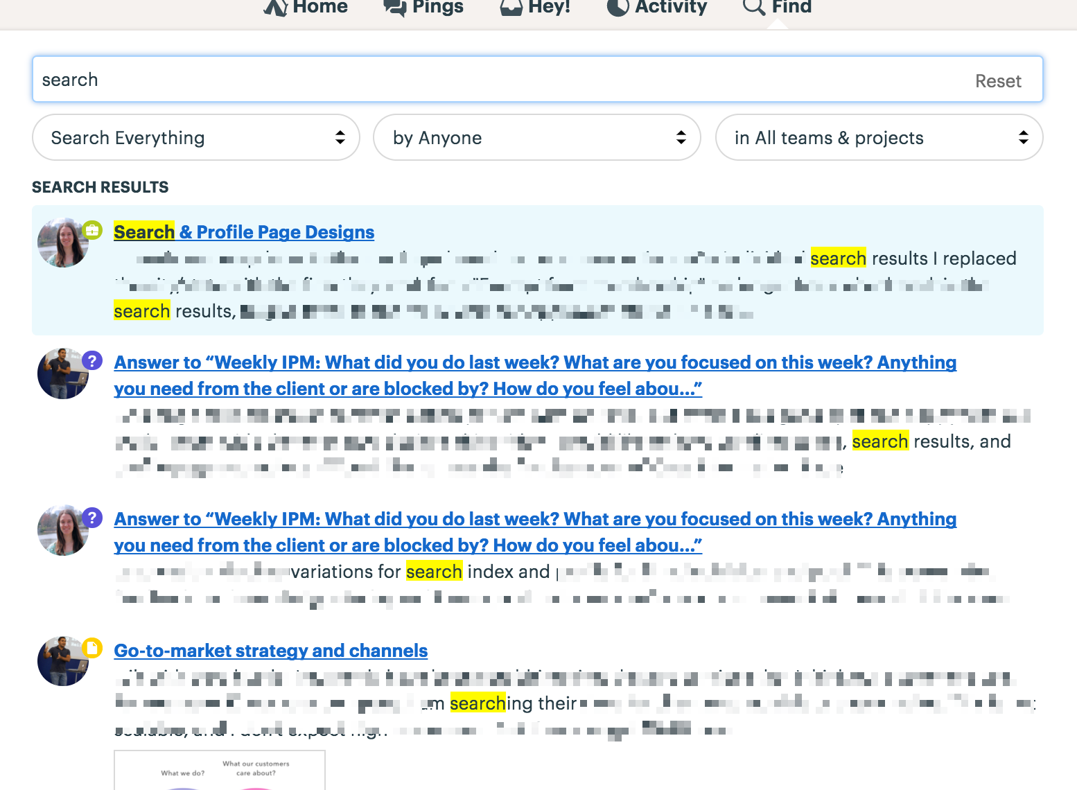
And of course, sometimes you want both free text and filters combined. The image above from Basecamp shows one example of this. While the heart of the search is the free text (this will search against the unstructured content of Messages or Documents), a user can also filter by Type (currently shows “Everything), Author, or Project.
When using free text search, designing a “reason for match” feature is imperative as well. The most common example of this is highlighted text. Communicating to the user why a result is returned, and where in the result that free text exists, is critical to a good search experience (Basecamp has this above). This is less relevant for filters; unless you are applying partial match logic. In which case, a user should clearly understand which filters are missing from the results.
Ordering results
Ordering and ranking results is one of the hardest things to get right in search design. And it’s something that is constantly evolving and growing as the data changes. The first question we ask is whether or not we need a concept of “rank” at all? If so, how do we rank?
Many times, ranking is not important and there is a method of displaying results that makes more sense and is much cheaper to build. Alphabetical or some sort of “most recent” are common display choices. But, if we have searches that include multiple filters, and we allow for partial matching, then “relevance” becomes more topical in the search discussion.
If search relevance or ranking are a requirement, I strongly recommend leveraging a search indexing service like ElasticSearch or Algolia to handle this. In the projects we work on, building custom search algorithms are rarely in scope, so I can not speak to the costs/benefits of that specifically. But, we have always found a way to use a search indexing service to address any ranking needs we have come across.
An important feature to think through is how the product communicates the ranking of results to the user. Often we see rank or relevance applied and it’s a black box to the user. Remember that if a pure “rank” is applied to search, it is hard for a user to compare results. Is #2 twice as good as #4? How much worse is #25 than #8? If “relevance” is applied to results, it is often difficult for a user to understand the scores. Why is this a 97% match? Is 97% a good match, or are most of my matches that high? The design choices that need to be made here are highly contextual and depend on the relative importance of comparing results.
3rd party search indexing
We have now worked through why someone is searching, the types of results they will see, how we will design the search interface, and the order in which we will display the results. Now we need to figure out how the query will actually be performed. The technology behind modern search experiences can be complicated. Designing the UX is hard enough to get right, but building the search algorithms and rules can be even harder. That is why we typically lean on some sort of hosted search index. We typically use ElasticSearch but have also investigated using Algolia.
There are many benefits to leveraging existing search technologies, and in our experience, they are always worth the tradeoffs (there are plenty of scenarios where it might not make sense, but we haven’t been confronted with them yet). Most of the benefits fall into three buckets; flexible search logic capabilities, performance, and results ranking.
It’s pretty hard to get search “right” the first time around. Once you test it a few times in the wild, you will realize you’ve missed something. There will be different fields you want to search against, you might want to update AND/OR (see below) logic, or you’ll need to return more data in the results. 3rd party services make it very easy to add new fields to the search query and to update the structure of those results.
And as you make those queries increasingly more complicated, the performance and speed of the search should hold up. With a 3rd party service, typically search will be run on it’s own server against a search index. Think of this like a copy of your database, that only has the data you want, and structured in the exact way that you want it. By searching against a separate index, you will not create bottlenecks for the rest of the application in the event expensive queries are being performed. You can also scale up and scale down these servers independently of the rest of your stack.
Special scenarios and other considerations
While the above list represents the common product, design, and technical themes we investigate when designing a search experience, there a number of nuanced challenges in search. These are the things that seem small, but have a big influence on both the form and function of search. The devil is certainly in the details, and search is no exception to that. If any of the below are requirements, it will influence how we build our experience:
AND/OR
When a user applies filters to a search, do we only show results that match all of the applied filters? Or do we show results that match any of the criteria?
As a rule of thumb, when a user is applying filters across attributes, they expect their results to match all of those applied filters. A good example is a real estate search. If I set a price range of $300–500k, with 3+ bedrooms, in Chicago, IL, I expect my results to match all of those filters.
By contrast, if for the location of that search I select Old Town, Lincoln Park, and River North, I would expect results matching any of those locations to show up.
Now given my example, you might say “Of course Paul, an apartment can’t be in all of those locations, so it’s obvious that the user wants those filters to be applied in an OR context.” But many times the distinction is not so clear. A great example of this is searching by “tags.” On Medium, if I want to see articles that have tags #product, #ux, #startup. Am I asking for articles with any of those, or all of those? In real estate search, this might show up in filtering for amenities; pool, finished basement, on-site gym, covered parking, etc. In this scenario, we might include some kind of AND/OR toggle in the search which allows the user to specify how they want to apply those filters.
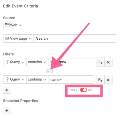
I have been noticing this trend frequently in data analytics tools. Sometimes you want to identify a user who completed ALL items in a list of actions (they clicked sign up, AND put in their credentials, AND clicked submit). Or you want to track a user who did ANY of a list of actions (we have a sign up CTA in 4 places — did they click button_1, OR button_2, OR…).
Building this logic on your own can be complicated, so I suggest using a 3rd party search index like ElasticSearch. They make handling this type of query straightforward.
Zero Results
We often look for ways to avoid the horrifying “0 Results found” state. There are a few techniques we can use to help eliminate this outcome which I will go over below. But there are times where returning “No results found” is extremely helpful. A reservation search is a good example of when zero results can be helpful — knowing something is sold out, while frustrating, is useful.
Another example is when you are searching for something with applied filters like real estate. Given the below home buyer, it’s helpful for them to know that their expectations might be unrealistic, and that they have to rethink their home purchase. I also like how it suggests how to maybe find some more results:

Sometimes you want to avoid zero results. There are a few strategies to do that which I will describe in the next few sections.
Partial matching
The first is partial matching. In a scenario where many filters are applied, this might be a good solution. The challenge is figuring out which filter to compromise on. For example, if there are no 4 bedroom houses under $200k, should we show 3 bedroom houses instead? Or 4 bedroom houses under $500k? It’s very hard to predict the users non-negotiables in search. I like partial match in a free text search more than a filtered search. Allowing your search to correct for misspellings, skipped words, etc. enhances the search experience. It doesn’t make it more confusing.
Filtering of filters
The next option, which is my least favorite is what I call filtering of filters. This can be a confusing pattern for the user to figure out and tends to be pretty difficult to implement technically. So I advise against it in most cases. What I mean by filtering of filters is to dynamically display filters, based on previously applied filters, to avoid a zero results output.
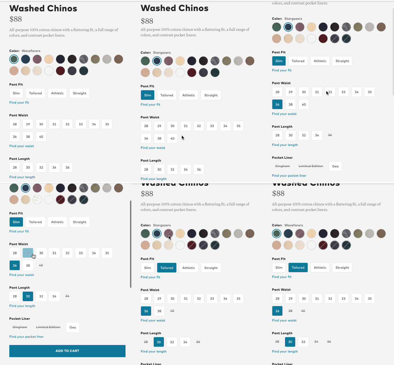
So in the real estate example above, once I select a $200k max price, it wouldn’t even let me select 4 bedrooms as a filter since there are none. One scenario where I have seen this work decently well is e-commerce. More specifically, when the the goal of applying filters is to end up at one specific result. In the below example, you can see how Bonobos filters out styles and size options that are unavailable once I start applying filters.
You might be interested in…
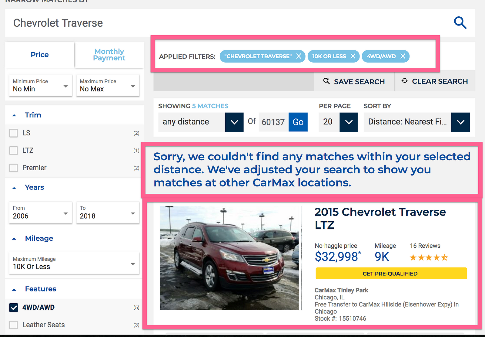
The last option is a “You might be interested in…” feature. This is a better pattern than pure partial match as it explicitly states there were no results found. At the same time, gives the user some options about how they may want to adjust their filters. You are still left with the product challenge of trying to figure out which specific filters you should add some blur to. But it makes communicating that much easier.
This design pattern is not specifically reserved for the zero results scenario. It can be used even if there are existing matches. Below is a great example of CarMax letting me know EXACTLY how they changed things to show me some results:
Closing
These are the product patterns for search that I run into most frequently. But this by no means represents an exhaustive list. There are plenty of other design and product considerations that exist as they relate to search.
The important thing to remember is that there is no one right way to design a search experience. There are patterns we can follow and examples we can leverage for ideas. But your search experience will depend highly on your user’s context and goals. Your search experience will be unique to your product.
It will even be unique to the lifecycle of your own product. As your product grows, and you learn more about how search is being used, you will iterate and improve your search experience.
We have helped a number of clients design and build new search experiences. So while the examples above are observed through research and usage of popular products, we have used all of these tactics on on our client projects. We have worked with non-profits, startups, and enterprises to build and design modern search experiences.


