
Learn how Kubo helped improve care by capturing patient sentiment, analyzing feedback trends, and boosting online reputation—all with HIPAA-ready tools.
Kubo Health helps healthcare providers collect and analyze patient sentiment survey data to monitor and improve their performance.
Most healthcare providers currently have no access to data surrounding a patient’s feelings about their experience. This not only impacts their external ratings (Google, Facebook, Yelp, etc.), but also patient churn and the facility’s ability to know where to invest to improve.
Kubo Health initially planned to launch with a suite of 3 core products tackling 3 different operational problem areas in the healthcare provider space (reimbursement, discharge, re-admittance). However, after conducting a series of user interviews with providers, it became apparent that the most impactful would be a simple, yet powerful way to measure patient sentiment.
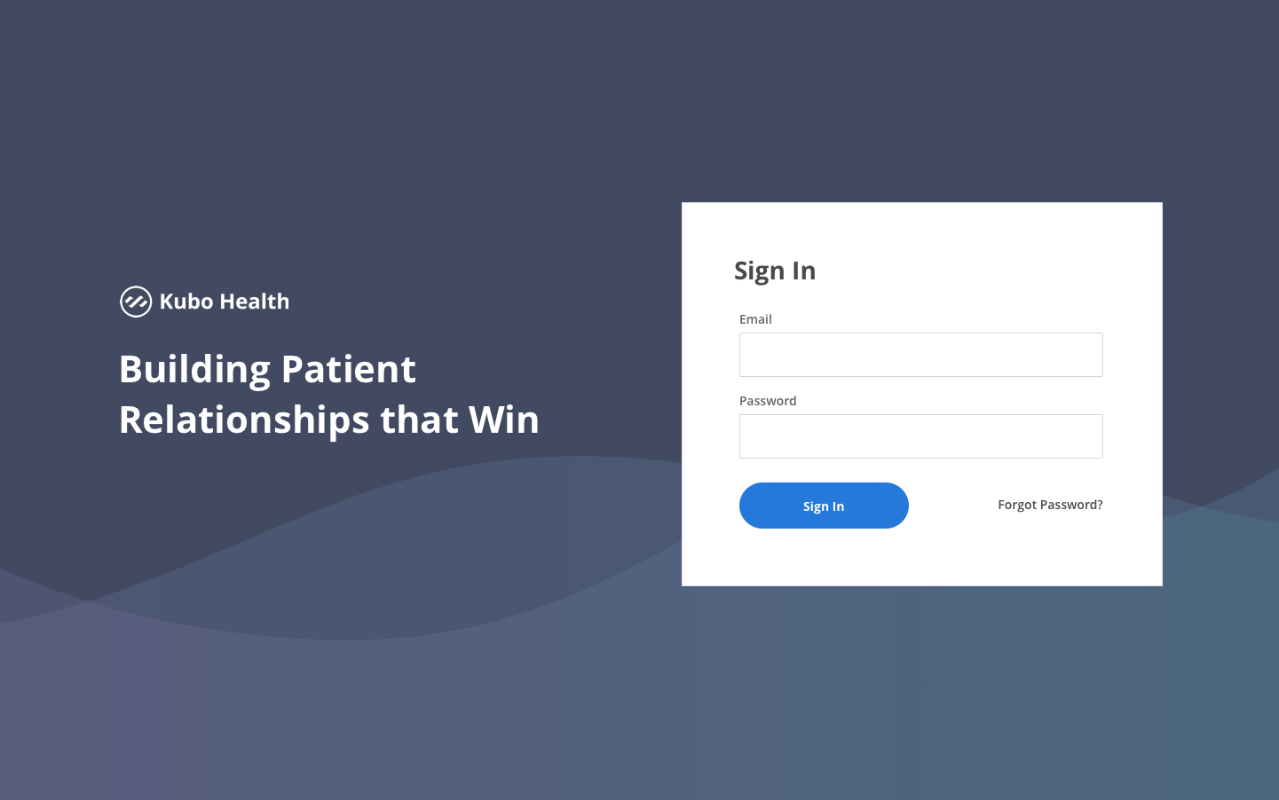
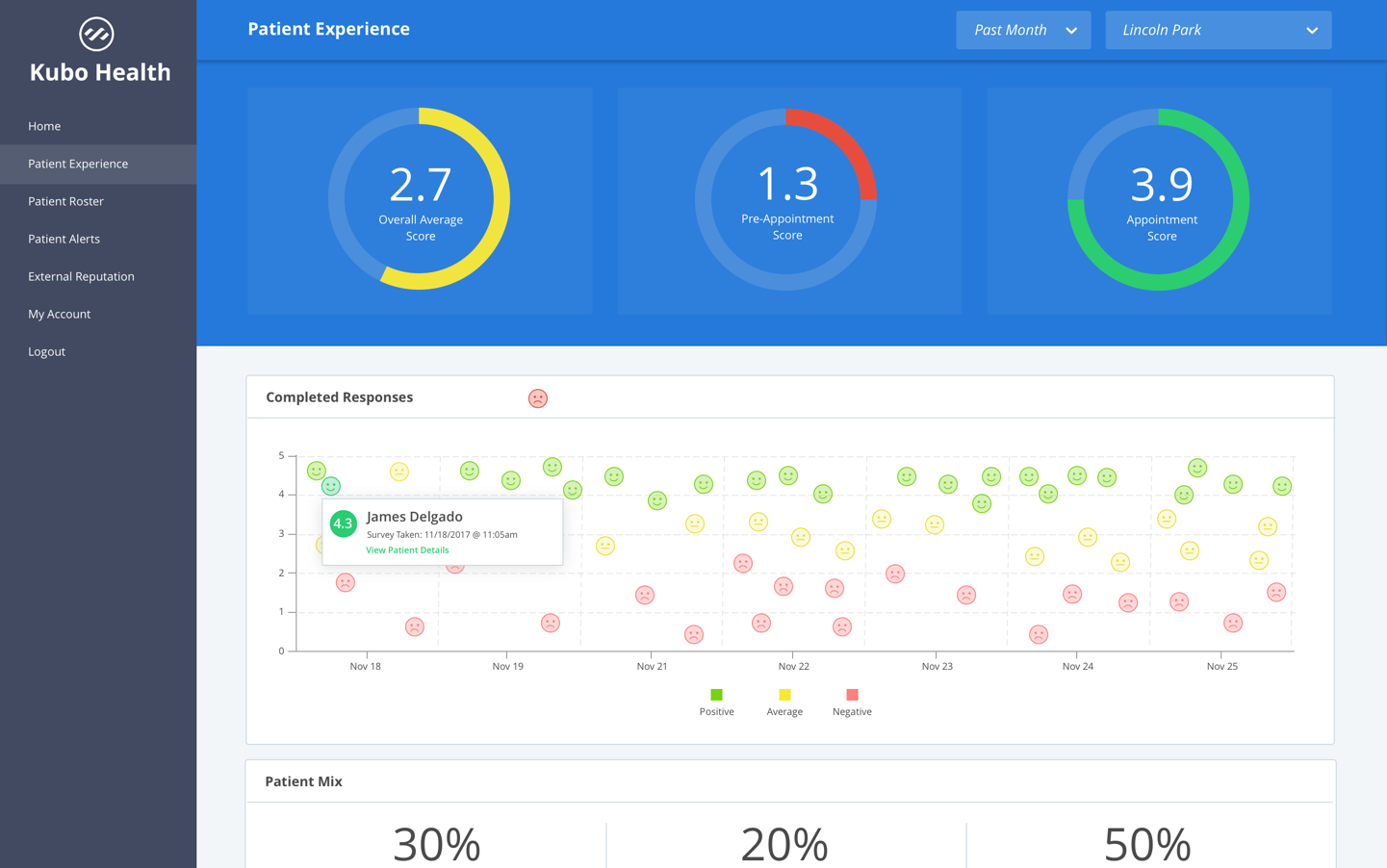
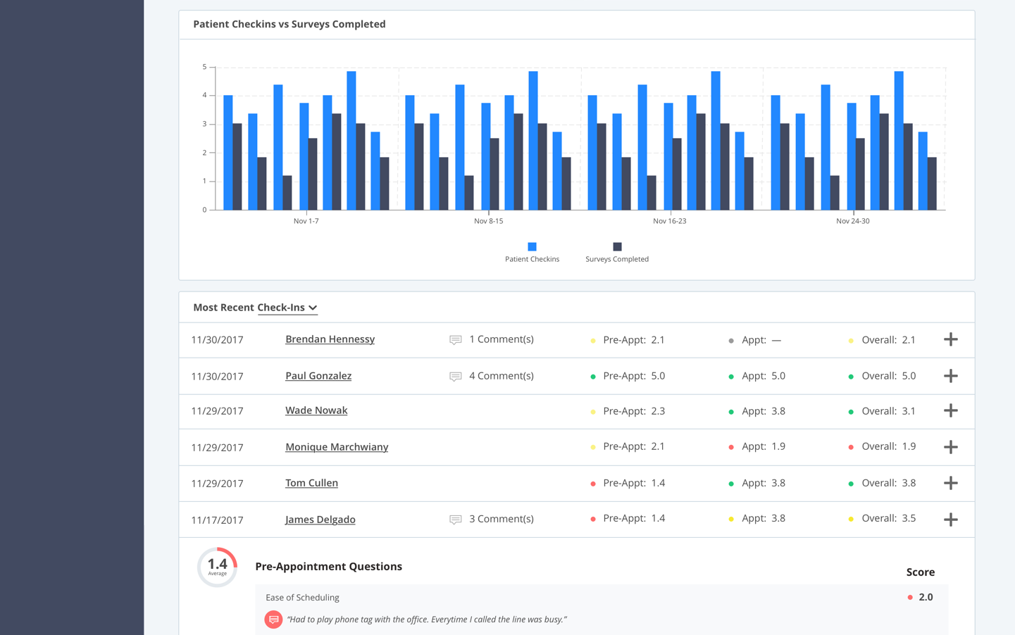
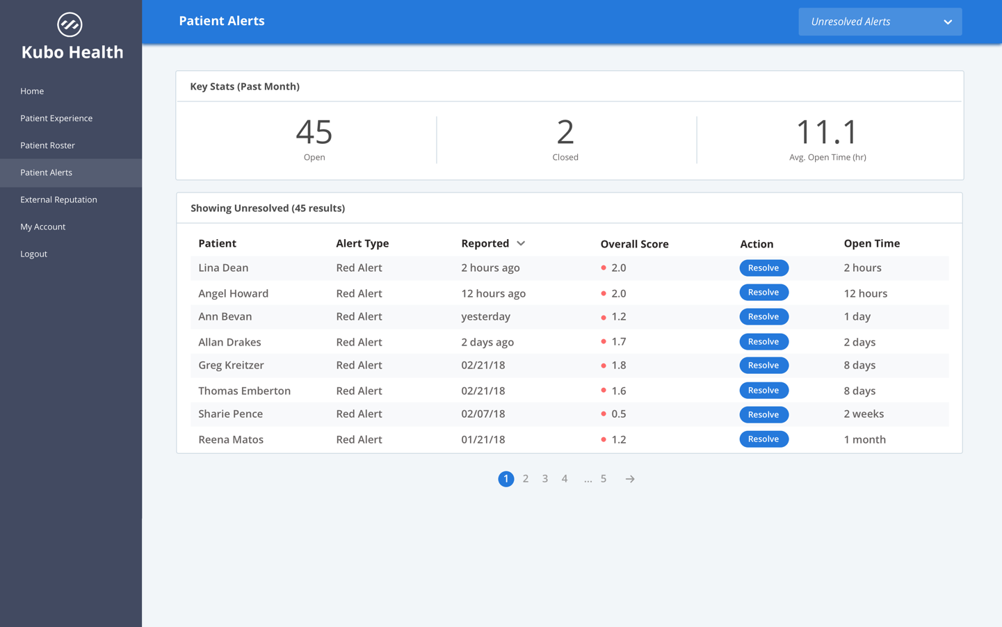
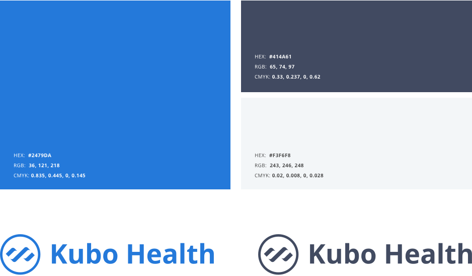
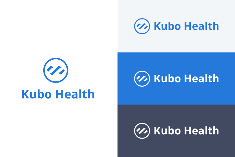
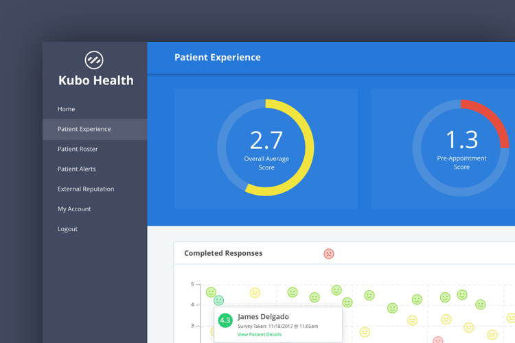
With a company mission of improving patient experience, Kubo Health’s brand had to reflect those ideals with a friendly and approachable visual style. Typographically we chose a font that was highly legible, yet modern and welcoming. The color palette consists of shades of blue to evoke stability and trust. In the admin dashboards we use green, yellow, and red to communicate results based on score, making it it easy for providers to digest information at a glance.
The logo combines abstracted DNA iconography shaped as an infinity symbol to illustrate the continuous value Kubo can provide both patients and providers.
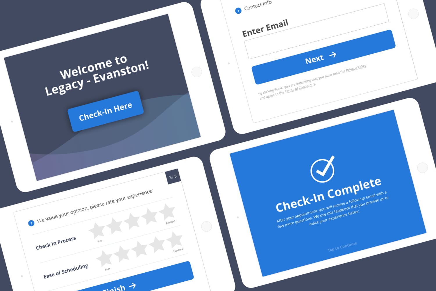
We iterated through several versions of the survey taking experience since it’s a critical feature of the application. The entire survey is optimized for tablet, with careful consideration to button and font size due to the elderly population of many patients. The home screen animation we designed has subtle waves that create a calming feeling and evoke visual interest to attract patients towards the tablet kiosk during appointment check in. The survey completes with another animation to give the patient a sense of accomplishment for successfully checking in.
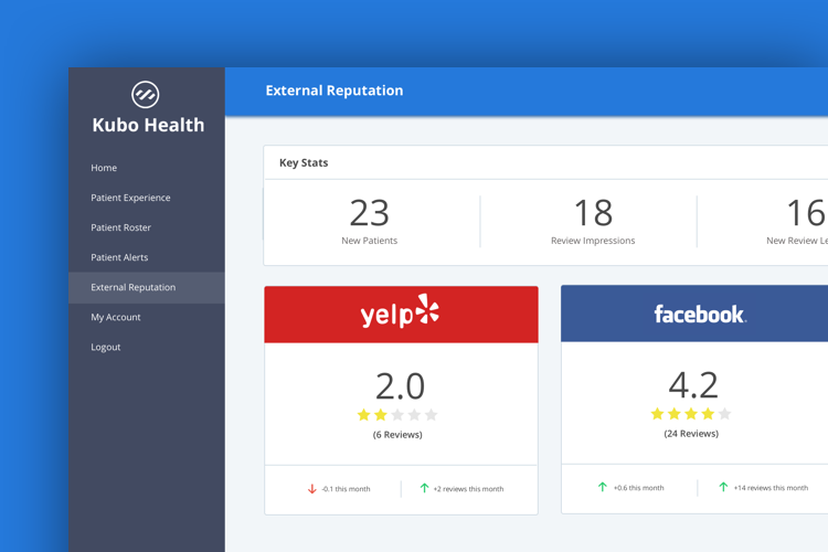
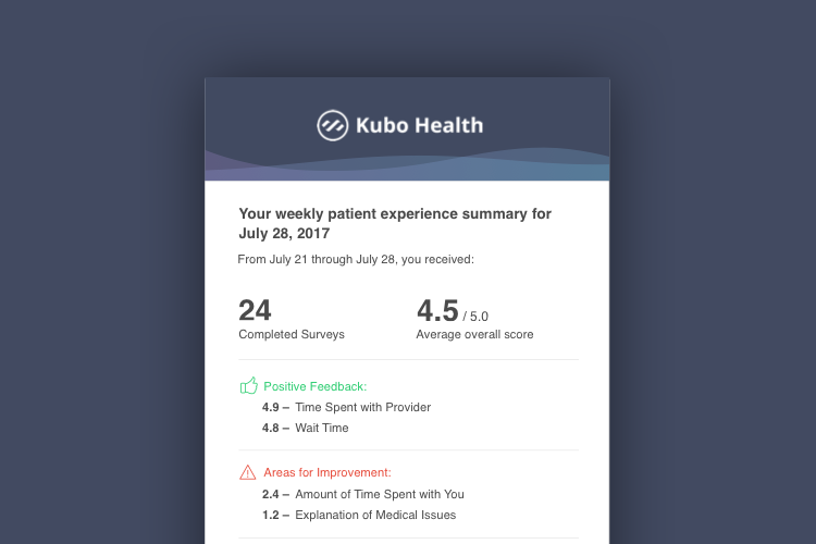
As for the provider side of the application, we show several graphs and metrics to summarize data. And as we know doctors live busy lives, so we also provide styled weekly snapshot report emails to ensure doctors get an overview of how their practice is doing without requiring a login into the platform.
As we see more and more surveys come in through the app, we are able to analyze that data and see additional ways providers can help improve their patient’s experience.
Partner with us to develop technology to grow your business.