How Prevent Blindness Rebuilt Its Website to Drive Education
See how the foundation launched a vibrant, accessible website with interactive tools and flexible templates—boosting traffic, engagement, and donor interest.
The Company
Prevent Blindness educates people on how they can maintain healthy vision for a lifetime. The organization strives to educate people about how to prevent blindness and preserve sight from infancy through adulthood. The foundation supports groundbreaking research and helps people gain access to vision care.
The Challenge
The primary way they deliver this information is through their website, which they felt didn’t reflect their brand’s message. They expressed concerns that pages looked too stark, text heavy, and lacked images. It was also difficult to navigate, not mobile/tablet friendly, and they were limited to using a single template for each page. What they truly wanted was a website that showed their passion for vision and celebrated the gift of sight.
The Approach
We met with the foundation’s team to discuss their goals for both the website and content management system so that it would appeal to both their national office, affiliates, and most importantly visitors to site.
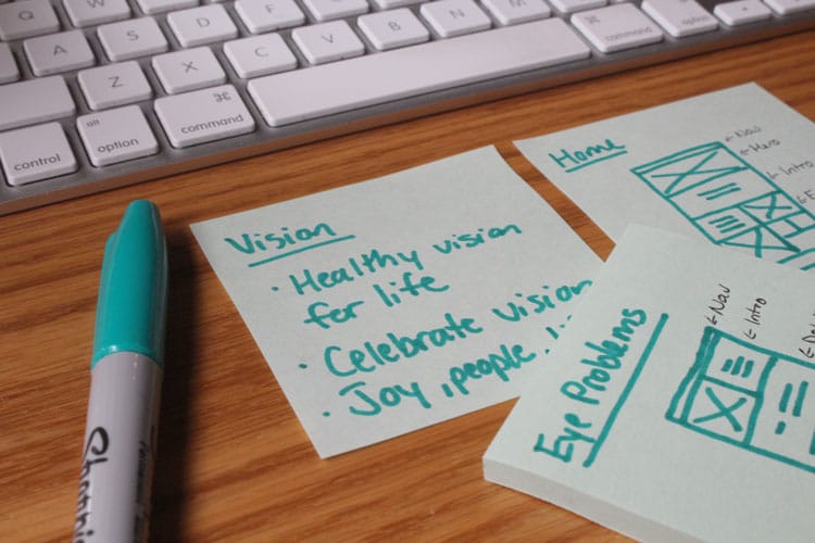
They came prepared to discuss the areas within the site they wanted to improve from security to site architecture to design. They also showed us a handful of sites that they liked either in terms of navigation or visual design. Our next step was to do some additional research, map out the existing site’s architecture (noting any areas that could be improved), and create wireframes based on our research as well as the notes from the kickoff meeting.
The Solution Design
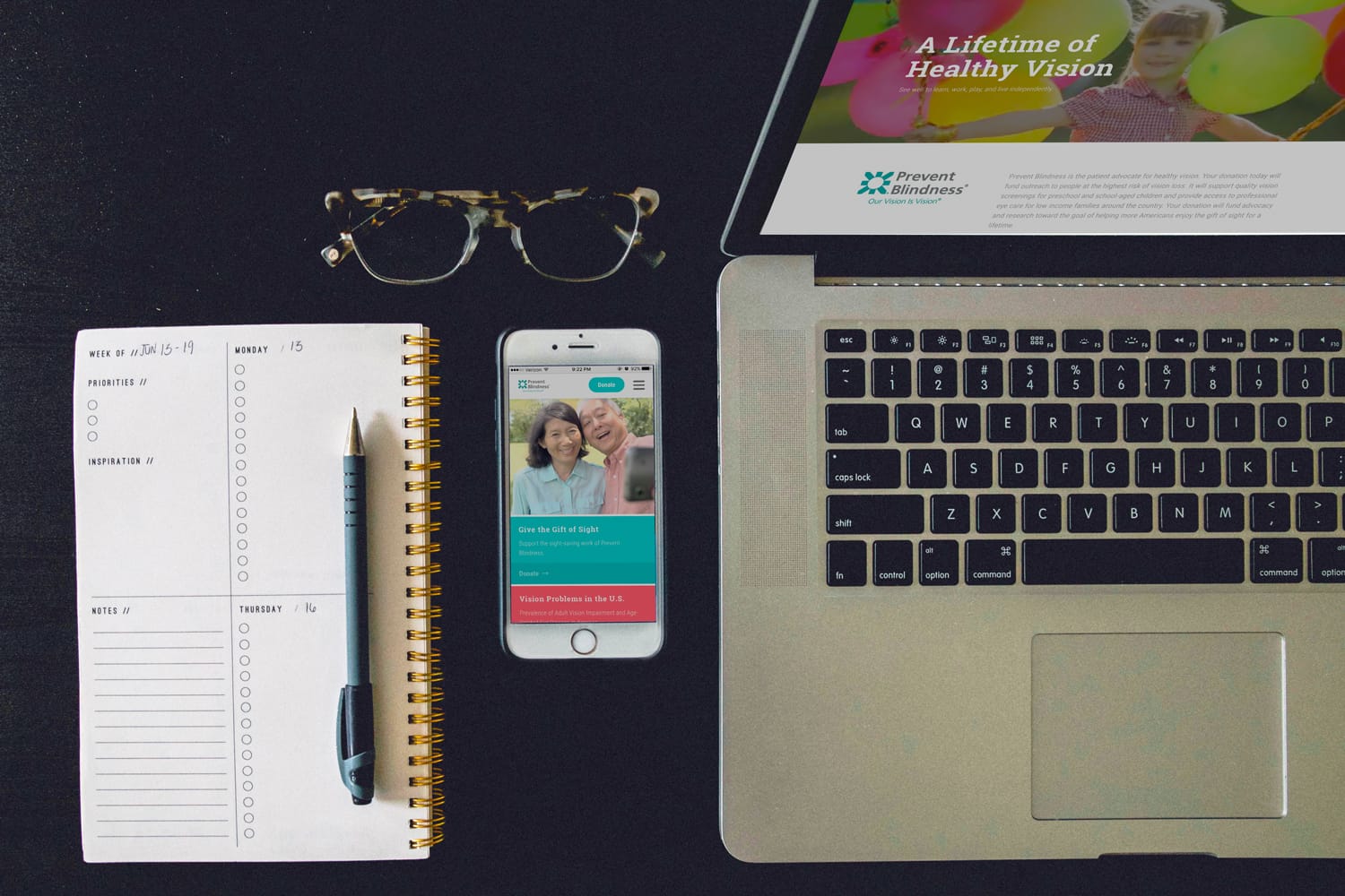
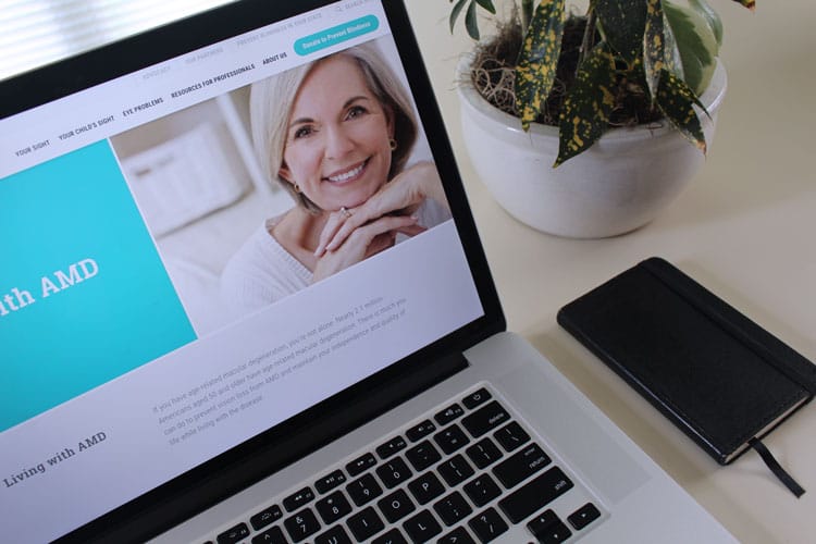
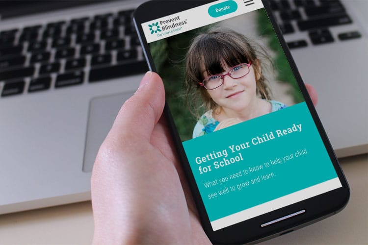
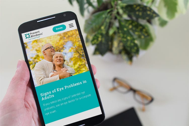
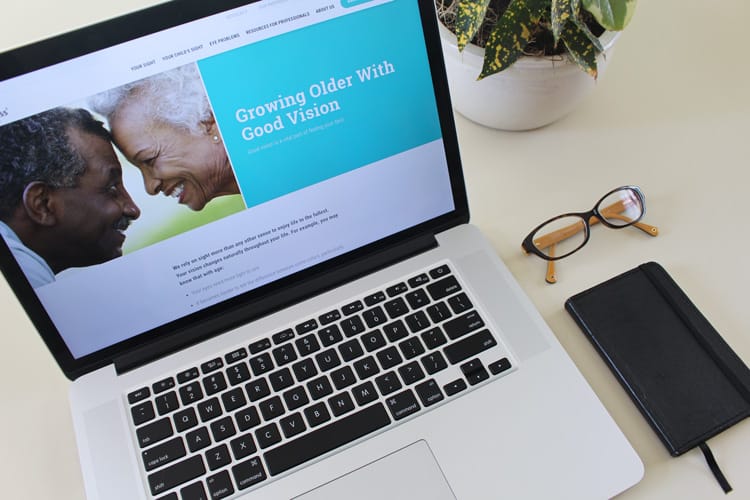
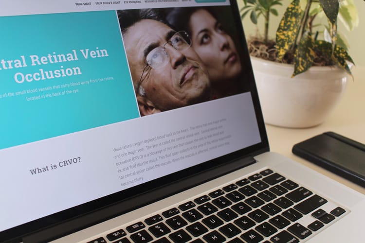
One of our goals with the new site was to celebrate vision, and what better way to do that than including splashes of color and plenty of engaging images. We created a color palette that complimented the logo and brought some energy and cheerfulness to the page. The typography was inspired by old vision charts which is why we selected a nice slab-serif typeface for the header and paired that with sans-serif for body copy to ensure strong legibility. We strategically designed layouts that are flexible and support any type of content or media, but also maintaining a level of structure and cohesion from page to page. Imagery is used to help show Prevent Blindness as a very welcoming and approachable organization with a focus on helping you any way they can.
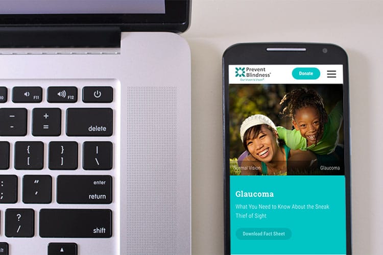
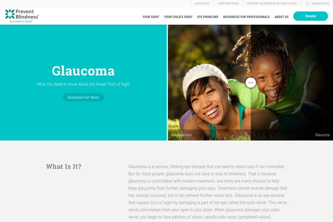
One of the key features we built is an interactive slider that allows you to compare normal vision vs various eye problems. The images in these sliders not only help you better visually understand the effects of the eye problems, but also show the demographics of the people typically affected by the disease.

“The interactive guides produced by LaunchPad Lab continue to attract new constituents and donors, increasing web traffic for both national and affiliate entities.”
—Ken West, Marketing Director
The Solution & Results
We started by organizing the site architecture and navigation, where worked closely with the Prevent Blindness team to simplify and re-categorize the content to make it easier for users to find the content they’re looking for. With this foundation in place, we designed several templates tailored for specific types of content. The templates created some visual variety and hierarchy. As for the design, we brought the pages to life with the use of color and imagery. The content management system we built provides admin users with all templates and plenty of options for customizability.
What’s Next?
We continue to make improvements to the site to incorporate Prevent Blindness’ new initiatives. Our goal is to make sure that both the national and affiliate offices are happy with the site and understand how to use the content management system. With any new CMS (in this case an upgraded version), there is a slight learning curve for admin users to understand where everything is and what items they change, so we make ourselves readily available to eliminate any confusion.

Ready to Build Something Great?
Partner with us to develop technology to grow your business.