
Insights
Our perspectives on the latest developments in technology and business.

All Insights
-
 Business
 What Is AI Agent Orchestration? Patterns & How It Works
-
 Business
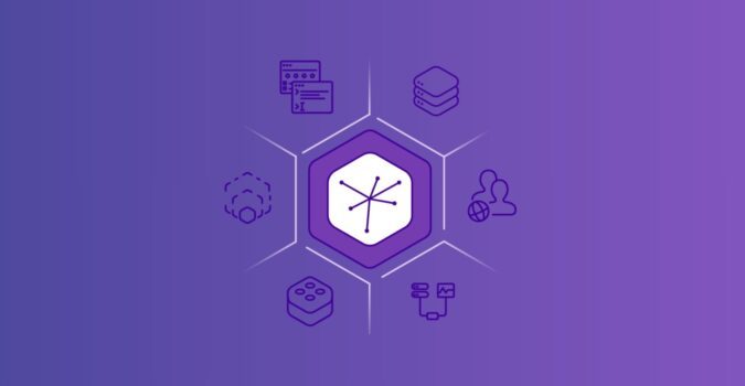
 AI Agent Architecture: Patterns, Components & How to Choose
-
 Business
 AI Agent Workflows: A Practical Guide
-
 Company
 LaunchPad Lab Partners with Render to Help Clients Ship Faster
-
 Development
 Custom Software vs Off-the-Shelf: How to Choose in 2026
-
 Development
 Heroku’s Transition to a Sustaining Engineering Model
-
 Business
 Igniting Innovation at BrokerTech Connect Chicago
-
 Business
 What Is Enterprise Software Development? A Complete Guide
-
 Business
 Adaptive Software Development: Flexibility for Changing Business Needs
-
 Business
 How Much Does It Cost to Develop an App in 2025?
-
 Business
 App Development Firms: What to Look for in a Trusted Partner
-
 Business
 Top App Development Companies: Leaders in Innovation and User Experience
On-Demand Webinars
- Webinar
Beyond the Hype of AI: Real-World Use Cases to Drive Business Outcomes
Welcome to the future of AI-powered innovation! Let's dive into GPT-4 and how it can enhance your business operations, streamline processes, and ul...
- Webinar
Lightning Web Runtime
Exploring the Key Elements and Benefits of Lightning Web Runtime (LWR) vs. Aura
- Webinar
Reimagining the Modern Product Organization
Exploring the evolution of product development and how AI is changing the landscape for product teams.
Browse Categories


Ready to Build Something Great?
Partner with us to develop technology to grow your business.