Once a site is launched it’s important to not forget about accessibility. The content that gets added to your site via your favorite content management systems like WordPress, Contentful, Prismic, etc can negatively impact your compliance if not done correctly. Below are a couple easy guidelines to follow when creating new pages and editing content.
Image ALT Text
All non-text content that is presented to the user has a text alternative that serves the equivalent purpose (Guideline 1.1.1).
When a user is visually impaired, alternative text gives them context about what the image conveys when using assistive technology (like a screen reader). It’s also very beneficial for users when an image doesn’t load (like if there’s a slow internet connection or broken image paths). An added bonus of writing good alt text is better SEO.
Tips:
- Alt text should be fairly descriptive, but concise (under 125 characters).
- Ideally images should not include any important text within the image itself because it could potentially fail to meet contrast requirements. But if absolutely necessary, make sure that the alt text includes that text so visually impaired users don’t miss out.
- Avoid starting alt text with “Picture of…” or “Image of…”. This becomes redundant since screen readers announce that the element is as an image. So alternative text that says “Image of a boat” would be read aloud by a screen reader as “image, Image of a boat”.
- You don’t need alt text for purely decorative elements. Meaning if the image is not adding any new information, is strictly visual in nature, or is described by surrounding text on the page.
Example:

- Weak Alt Text: Dog
- Good Alt Text: A very alert Mini Australian Shepherd laying on a couch surrounded by pillows.
Headings
Section headings are used to organize the content (Guideline 2.4.10).
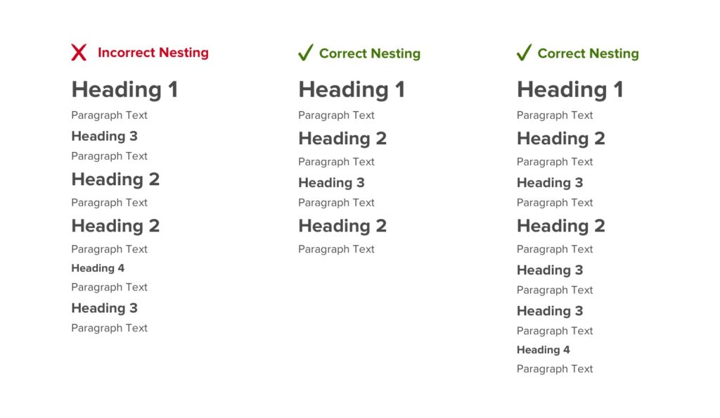
Headings on a page must be organized based on the content’s hierarchy. And while someone might want something styled like a particular heading level (to show more or less emphasis), it’s important to keep the proper structure.
Tips:
- Only one h1 per page
- Use heading in the correct order, h2, followed by h3, followed by h4, followed by h5, and lastly followed by h6.
- Example Issue: You have a section where you use an h2 followed by some paragraph text, and then the next heading you use is an h5, but in reality you should have used an h3 because that’s the next heading level after an h2.
- Don’t use the bold feature to denote headings — even though it gives sighted users the appearance of a heading it’s structurally incorrect and as a result won’t show up as a heading for users leveraging screen readers.
Example:

Link/Button Text
The purpose of each link can be determined from the link text alone or from the link text together with its programmatically determined link context, except where the purpose of the link would be ambiguous to users in general (Guideline 2.4.4).
A user should have a clear understanding of the purpose and destination of each link on a page. Screen readers have the ability to generate a list of links that a user can choose from to help users navigate a website or app.
Tips:
- Link text should be meaningful when read out of context.
- If the same link text is used multiple times on a single page it should share the same purpose/destination.
- Avoid using generic or ambiguous link text like “click here”, “learn more”, etc. When text links like these are generated by someone’s screen reader they lack context—seeing a list of 10 “click here” links is pretty useless.
- Keep it short and easy to say. Users of speech recognition technology are able select links with their voice, so avoiding lengthy text links and tongue twisters is best.
- Link text should help users to know something about their destination before they click on it.
- Use the title field to create distinctions below link text that is the same to differentiate destination or layer in additional context.
Example:
- Bad link text: “Learn More” goes to about page and “Learn More” goes to contact page.
- Good link text: “Meet our Team” goes to about page and “Contact Us” goes to the contact page.
Title & Description Tags
Web pages have titles that describe topic or purpose (Guideline 2.4.2).
Title and description tags summarize the content of a particular page. It helps people differentiate between multiple tabs open in a browser and easily navigate between them.
Tips:
- Every page should have a unique title and description tag.
- The ideal length for a page title ranges between 50–60 characters (users can enable screen readers to read out entire sitemaps so you don’t want titles to be too long).
- The ideal length for a page description ranges between 125–320 characters.
Example:
- Bad page title: Home.
- Why? It’s extremely vague…
- Good page title: Web Design & Development Company in Chicago — LaunchPad Lab.
- Why? It’s concise, more descriptive, and ideally unique to the website. It’s important to start with the most specific information in this example: “Web Design & Development Company in Chicago”. And then it’s good practice to follow that with the company (“LaunchPad Lab”) or application name to identify the website.
Additional Tips
- Avoid using random characters as a means of styling as these will be announced by screen readers.
- Embedded content like iframes should have title attribute.
- Tables should also have a title attribute.
So with all these tips in mind, happy editing!


