In the world of digital product transformation, white label applications offer a helpful opportunity for businesses to offer new products to their customers and continue to provide innovative and cutting-edge solutions.
Here at LaunchPad Lab, there’s nothing we love more than building beautiful, creative digital experiences that solve problems. When we work with our clients to create applications that will be available for white labeled purposes in the future, there are a few factors we keep in mind to ensure the final product is functional, collaborative, and captures the true essence of what our clients want.
Keep reading to learn about our top design considerations when building applications that will be white labeled.
What is White Labeling?
Before we jump into the design specifics, it’s first important to understand what white labeling is—and how it can contribute to your business.
“White labeling” refers to a customer’s ability to buy a license to a product and brand it as their own. A white label product is typically developed by one company and then packaged and sold by another, under various brand names.
Why Build An App That Supports White Labeling?
With a white label application, a client can offer an effective solution for their customers that allows the customer to incorporate their own branding, all without having to build the app or digital product from scratch themselves.
This can save the customer a lot of time, energy, and money. Once their branding has been implemented, it can even help the customer’s brand gain more visibility and strengthen user loyalty.
Design Considerations
When it comes to designing an application that will be white labeled, the first step is to determine the level of customization you want available. This can range from just a logo all the way to custom themes and other opportunities for bespoke personalization.
1. Logo
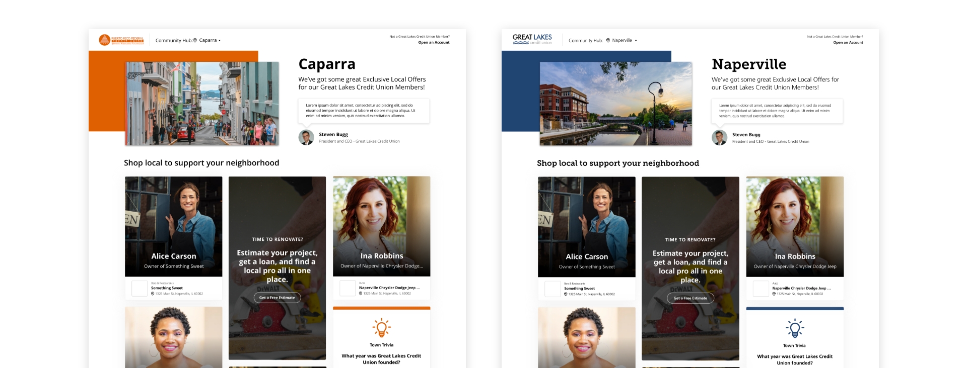
The most basic element of creating a white label application is allowing the customer’s logo to be featured as the primary logo on the product. Logos come in all shapes and sizes, so it’s important to find that “sweet spot” where the logos can be clearly seen, and have enough prominence on the page.
White backgrounds for logos tend to work better for this than colored backgrounds since most companies have a dark logo version. A colored background can also increase the potential for accessibility issues with color contrast ratios. Taking all the color out of a logo can also diminish some of its brand recognition.
2. Colors
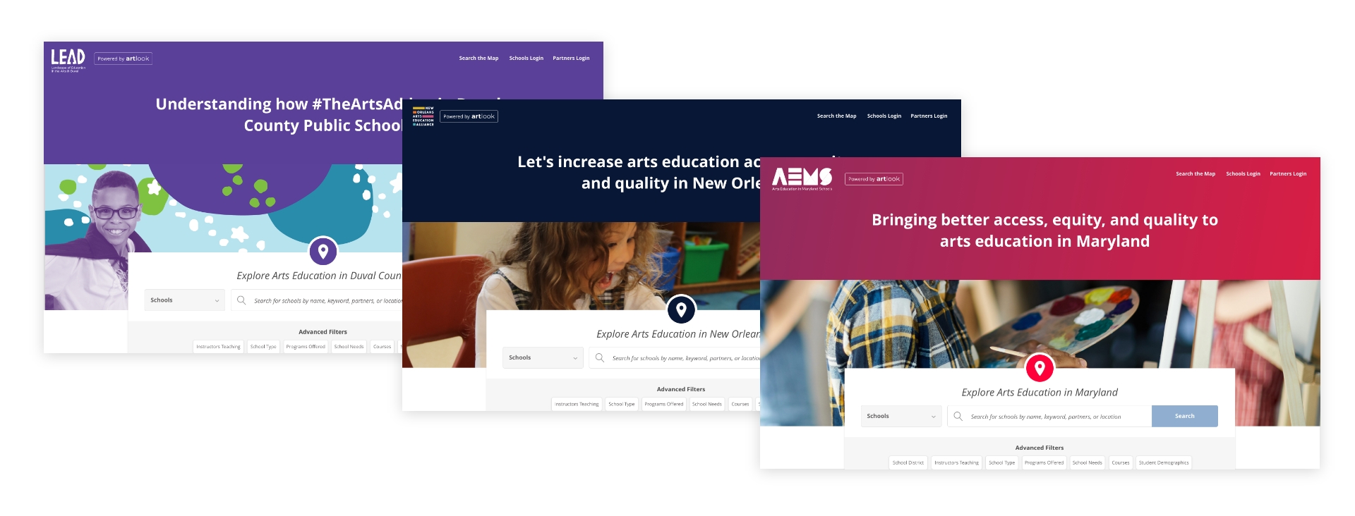
Brand colors are important as they can add something new and fresh to a white label product while making the app look and feel more like the customer’s own technology. When choosing how many brand colors to use, using a primary color rather than introducing secondary and tertiary colors can simplify things.
If you go with the latter, you’ll need to have a backup plan in case a customer only has one brand color. The same goes for the default color palette. Keeping it simple and neutral is often the best course of action.
Lastly, sometimes you might have customers with inaccessible color palettes, making it difficult for some users to interact with the application. In those cases, a general rule of thumb is to:
- Use colors only as accents
- Use tints of brand colors
- Encourage the customer to re-evaluate their color palette
3. Imagery
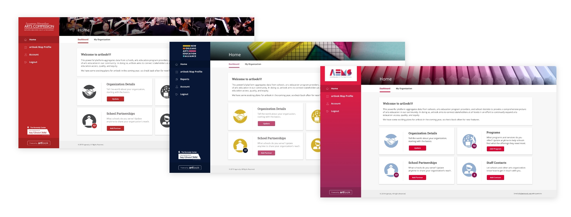
Images can help showcase the personality and essence of a particular brand, but there are some things to consider when using them.
First, make sure that the customer is using images that they have the right to use. Ask if a commercial license is necessary or if you’re in the clear to use it. Next, consider the image sizes and ratios. Make sure your customer is aware of the ideal dimensions for the images, as well as the potential for clipping or cropping if the recommended size is not followed. We prefer keeping all assets on a digital app under 500 KB for performance reasons.
SVGs are ideal for logos or icons, but for imagery, JPEGs and PNGs work best. Consider any awkward overlapping that might happen in images, and be sure to test and confirm that image ratios will remain the same across screen sizes.
4. Fonts
Brand fonts can help create a visual linkage to a customer’s digital ecosystem, and you’ll likely lean on the brand’s style guide to determine the proper fonts. If a font is paid, the first step is to review the license agreement and ensure that the font can be used for a white label app—if not, you’ll need to upgrade it to gain a commercial license or find an alternative.
Similar to colors, working with a single font is the easiest way to go. The more fonts you import, the heavier impact it will have on the page’s performance.
Lastly, if there are no web versions of the font, font files will need to be provided. Keep in mind that pricing varies for web vs. print versions of the font.
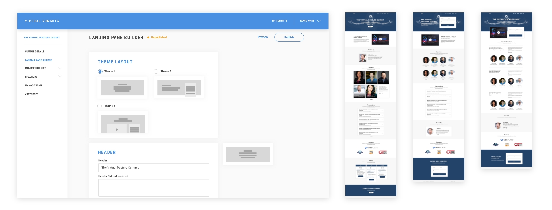
5. Themes
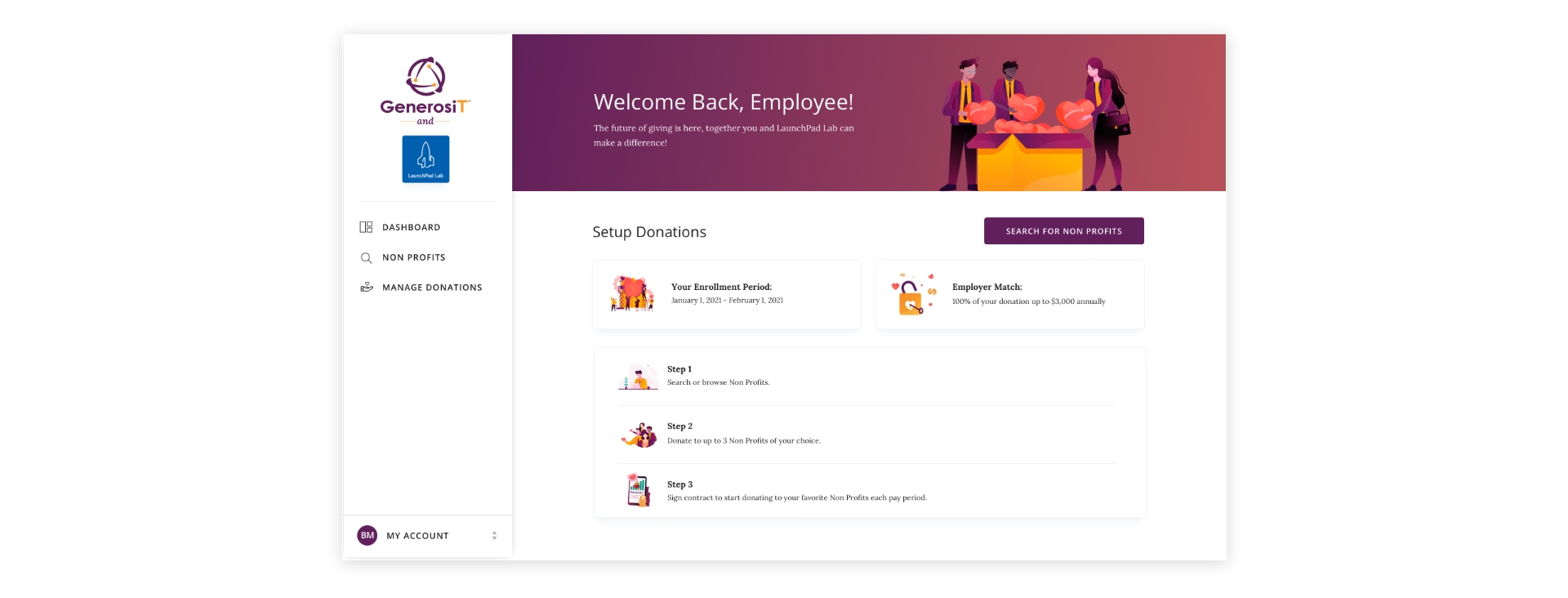
Lastly, your customer might have design or thematic preferences for how the app functions—and as a designer, you can ensure the theme of the app aligns with your customer’s goals.
Remember, each business is unique, so offering different layouts can help meet certain needs better than others. It’s helpful to keep the number of options available limited to reduce decision fatigue. This also allows you, as a designer, to have a stronger say on how to organize key information as efficiently as possible.
Other Considerations When Designing White-Label Apps
Here are some additional questions to think about when designing a white label app:
- Do legal pages need to be tailored to the customer?
For things like Privacy Policies or Terms of Use, it depends on the app. It’s always good to get the client’s lawyer involved to provide their recommendation.
- Will certain customers only have access to certain features?
If the answer is yes, a modular design is essential to make each experience feel “whole.”
- Will the original product be referenced at all in the white-labeled experience?
This is good marketing for the original product to drum up more business. Using something like the “Powered by…” link in the header or footer can be a great touch.
Our Approach to White Label Apps
Given that customization relies heavily on the customer’s preference, there are a few ways that branding could get implemented when onboarding a customer.
- White Glove (hardcoded): The customer provides branding assets to us and we include them into the code base.
- White Glove (with interface): The product support team is provided an interface where they can add and edit the customer’s branding assets.
- Self-Service: The customer is provided an interface where they can add and maintain their branding assets.
Ready to Learn More?
As you can see, designing a white label application requires strategy and forward-thinking in order to build something that sets your customers up for success.
If you’re looking for a partner to elevate your digital experience, LaunchPad Lab is ready to help. Our team can help you stand out from your competitors with an amazing, one-of-a-kind digital experience. Book your free discovery call with us today to get started.

