
To reduce drop-off and boost conversions, Chicago Line Cruises launched a modern marketing site with optimized speed, elegant design, and seamless mobile checkout.
Chicago Line Cruises has marketing site that allows people to purchase tickets online for narrated architectural and historical boat tours on Chicago’s lake and river.
One of the biggest issues Chicago Line faced was having a slow page load speed when users would try to purchase tickets online. Studies show that 40% of users will leave a site if a page takes longer than 3 seconds to load. This drop-off was apparent when reviewing Chicago Line’s analytics. And if a user did get to the purchase page on mobile, the screen they saw was not mobile-friendly making the ticket buying experience even more challenging. In addition, Chicago Line also wanted a redesign of their marketing site that would include more images and content to inform potential customers and increase their overall conversion.
We met with their team to gain a deeper understanding of their business goals and visual aesthetic. We completed a simple word association along with a few other design exercises, that helped us gain clarity of their vision. It was also key for us to collectively talk through the problem areas of their existing site and hear where they hope to be after the launch. Our following meeting took place on one of their boats, where we got to take in some wonderful views from the lake and get a sense of what their passengers experience when taking a Chicago Line cruise. Now we just needed to translate that same feeling to the website.
Chicago Line wanted a clean, modern, and high-end looking site to reflect the quality of their tours. We used black and white to create a sophisticated, clean look and allow the dynamic, architectural images to provide most of the color on the site. Red is used as the “Purchase Tickets” button color to make it easy for users to find. The typography is set in a modern fashion with strong contrast of bold and light font weights that help establish a visual hierarchy and allow for easy reading.
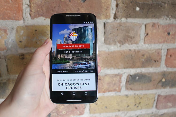
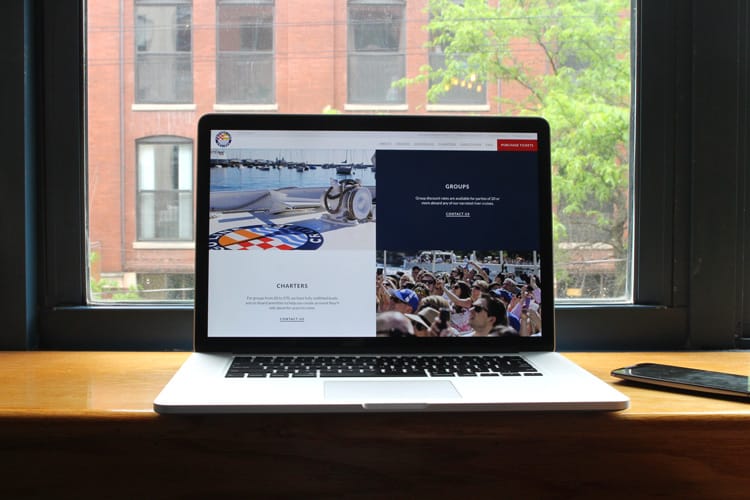
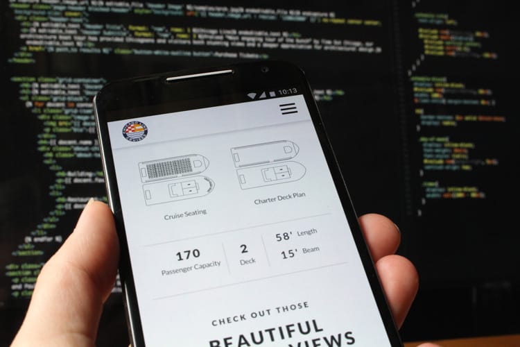
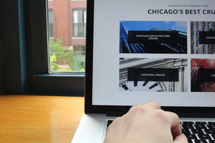
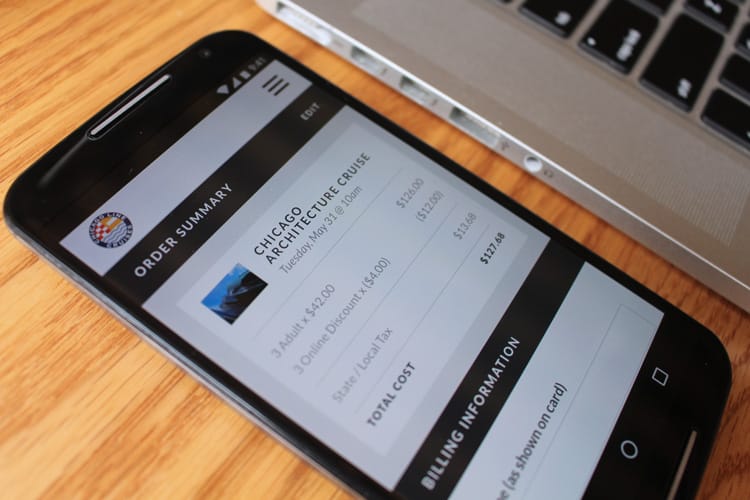
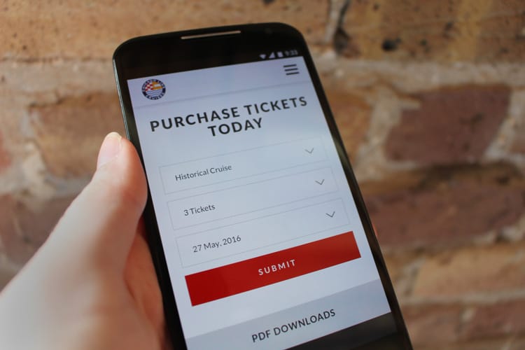
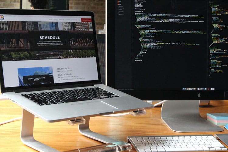
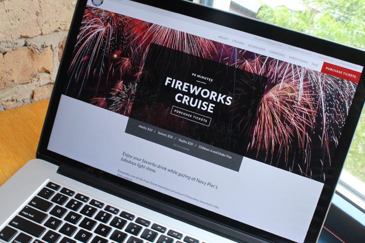
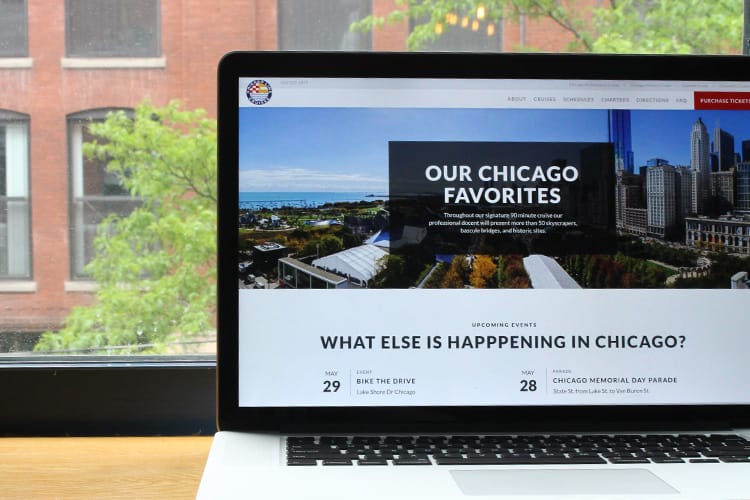
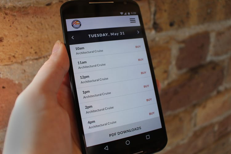
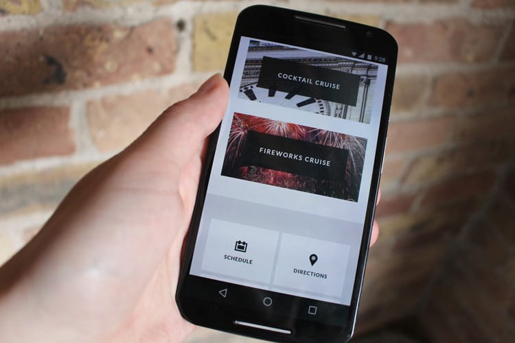
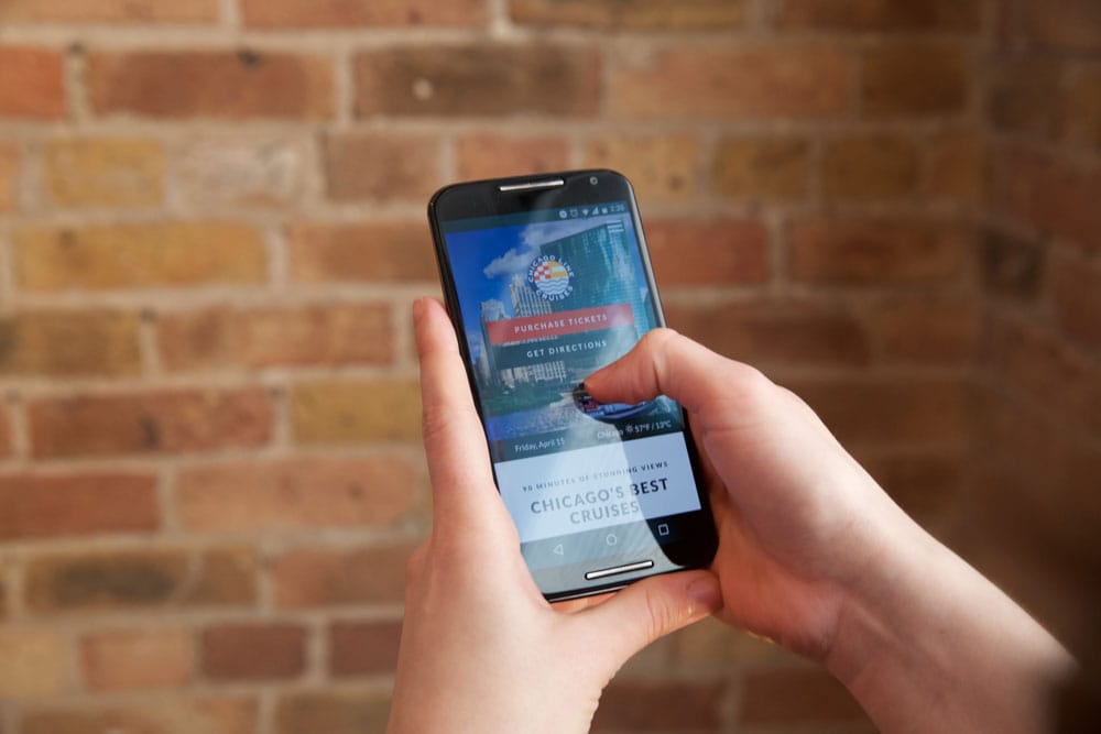
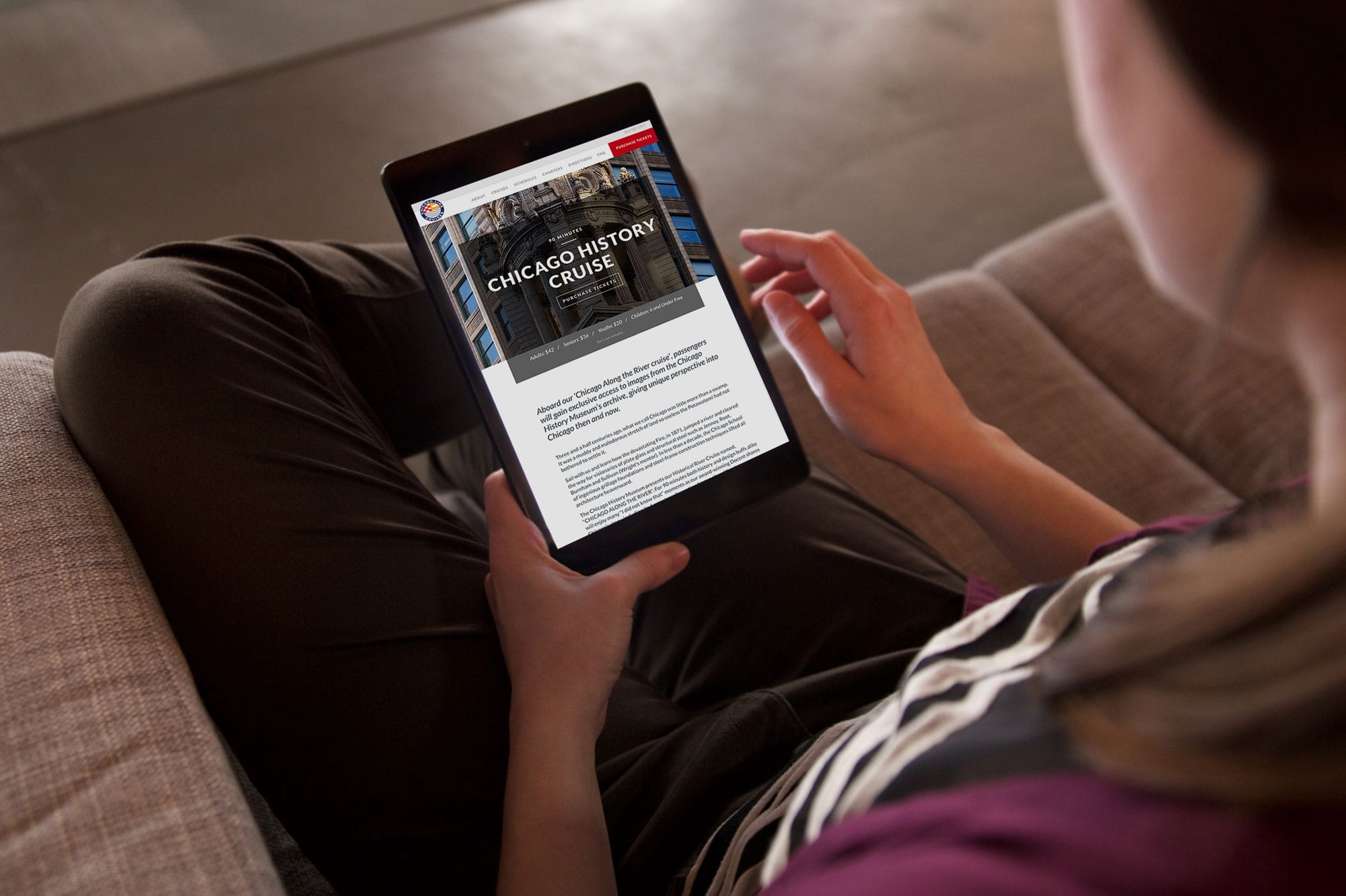
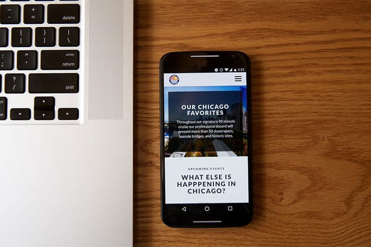
We designed and developed a ticketing integration that makes it easy for users to purchase tickets on any device type, with page speed as a top priority. As for the overall look and feel of the site, we designed a site that is modern and focused on conversion. The new layout uses elegant typography and color photography to bring life and a high level of energy to the page. The focus on imagery in this site helps excite users about the cruises Chicago Line offers.
We will continue to monitor ticket conversions and SEO ranking to see what areas we can make improvements on going forward.Maximizing the efficiency of the ticket buying process as well as providing quality content throughout the site will help them stand out from their competitors, and ultimately sell more tickets.
Partner with us to develop technology to grow your business.